Best Thumbnail Design for YouTube: 8 Proven Styles
Parth Jasrapuria
Founder
A busy professional scrolls through YouTube on a phone between meetings. A wall of tiny images flashes past, each one shouting for attention with faces, arrows, numbers, and enough text to qualify as a small ransom note. The best thumbnail design for YouTube isn't the prettiest composition. It's the clearest promise that matches the video.
For a B2B channel, that promise might be a faster workflow, a product feature, a hard lesson, or a measurable business result. This guide covers eight thumbnail styles, from bold text and data-led designs to product close-ups, human authority, curiosity gaps, colour blocking, and branded systems. Each style includes a practical use case, a trade-off, and a test that protects both trust and watch time.
Every design should be built in YouTube's 16:9 format and previewed at small size before upload. If a buyer can't understand the image on a phone, the desktop version won't rescue it. Teams exploring assisted creation can also review AI thumbnails for creators, then apply human judgment before publishing.
1. The Bold Text Overlay with High Contrast
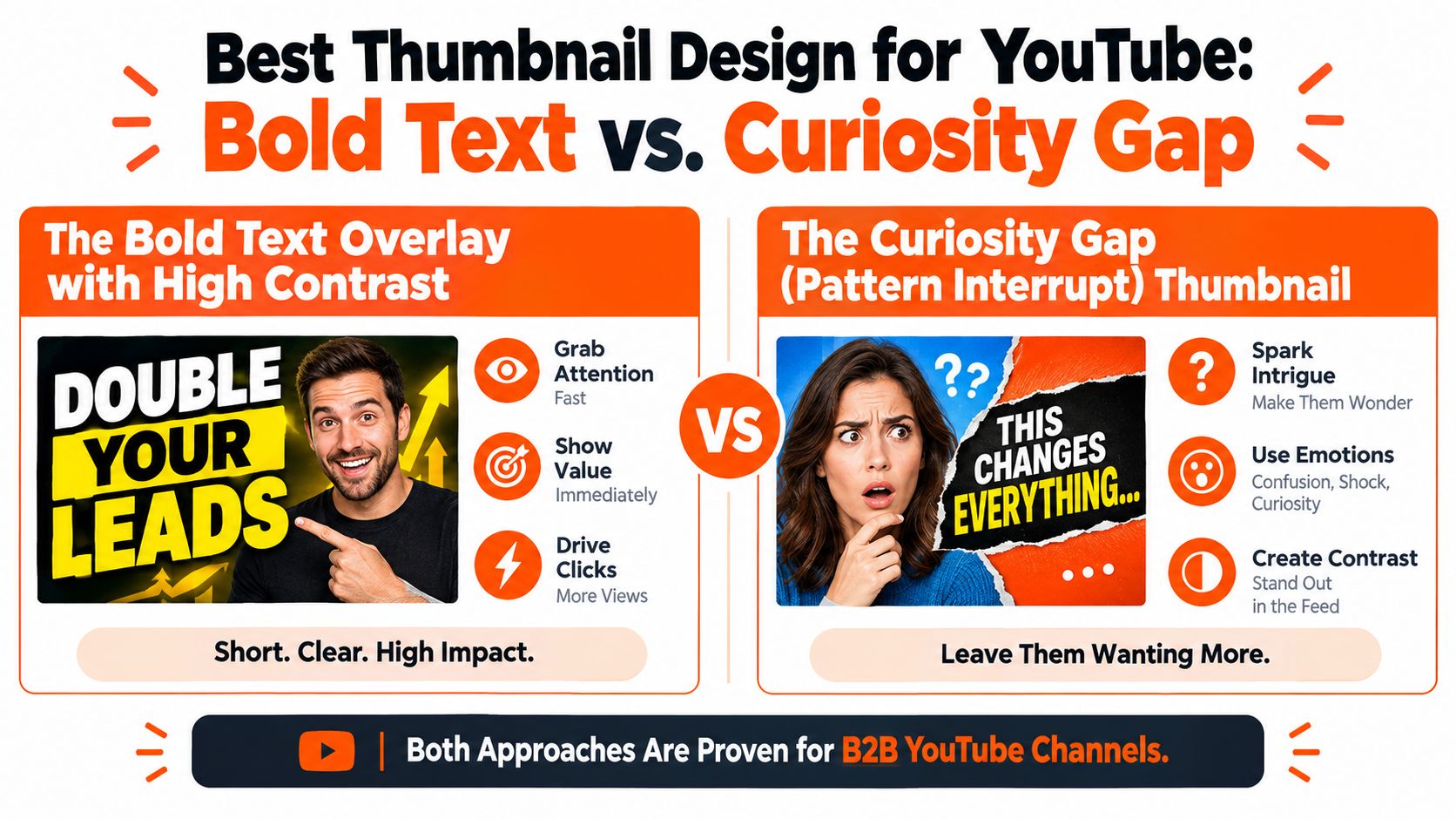
A buyer comparing software vendors may see your thumbnail for less than a second. Bold text gives that glance a clear job: communicate one useful promise through large lettering and strong contrast. A dark background with bright yellow type can work, as can white text over a rich brand colour. The design earns attention by reducing interpretation time, not by decorating the frame.
This style suits how-to videos, webinars, explainers, and tactical lessons where immediate comprehension matters. A software team could use “LOWER CLOUD COST” for a cloud-finance tutorial, while a sales consultancy might use “FIX YOUR PIPELINE” for a forecasting video. Each phrase promises a practical outcome. Keep it separate from the title, which can provide the method or fuller context.
Build the thumbnail in YouTube's recommended 16:9 format, then inspect it at phone size. YouTube's thumbnail analytics guidance identifies impressions click-through rate, or CTR, as the percentage of viewers who watch after seeing the thumbnail. Use that measure to compare how the promise performs across Home, Suggested, and subscription feed placements, especially during the first 24 hours.
Make the benefit readable before the coffee arrives
Keep the message short, ideally around three words. Thin fonts vanish in small previews, long phrases become visual noise, and text in the bottom-right corner can sit beneath YouTube's duration badge. Use these checks:
Choose one promise: Lead with a benefit, problem, or outcome. Do not turn the thumbnail into a miniature abstract.
Protect the edges: Leave padding around the text so it survives smaller previews.
Test placement: Compare top-left, centred, and upper-right layouts while holding the topic and title constant.
Check both themes: Review the design against light and dark YouTube interfaces.
Practical rule: If viewers need to read the text twice, move the explanation into the title or spoken introduction.
The trade-off is clarity versus curiosity. “CRM CLEANUP” identifies the subject quickly but may feel ordinary. “STOP LOSING LEADS” creates stronger tension, so the video must deliver a credible solution rather than a dramatic detour. Test both versions against the same audience and judge CTR alongside watch time. A bold overlay is doing its job when the promise is direct, the click feels fair, and the opening supports the expectation.
2. The Number or Statistic Highlight
Numbers can interrupt the scroll more effectively than cheerful faces or generic “growth” claims, especially for a professional audience. Give one figure most of the thumbnail, then add only the context needed to make its meaning clear.
This format suits case studies, finance content, campaign reviews, benchmarks, and performance tutorials. A B2B team could feature “300% IN 6 MONTHS” when the result is verified and explained in the video, or “27 DAYS” for a documented onboarding timeline. Invented figures create a trust problem, not a stronger hook.
A useful number answers at least one question about scope. Add a unit, time period, or business outcome so the viewer knows what the video promises. “300%” raises questions. “300% IN 6 MONTHS” signals a defined result and gives the title room to explain the method.
Build the evidence into the promise
Any statistic used in the thumbnail should be supported in the video, description, or related material. That standard matters in finance, analytics, healthcare, and B2B marketing, where viewers may act on what they learn.
Use the visual treatment to match the video goal:
Show the full figure: Choose this for a case study or benchmark where the result is the main reason to watch.
Reveal only part of the figure: Use restrained curiosity when the process, rather than the final result, drives the video.
Add business context: Pair the result with a timeframe, audience, channel, or starting point.
Keep colour controlled: Green may suggest growth and blue may signal stability, but colour cannot strengthen weak evidence.
A product-led company might compare “LEAD QUALITY” with “45% INCREASE” if the underlying result is genuine and available for scrutiny. A customer story could put the number in the image while the title names the method. The thumbnail earns attention, and the title supplies the missing context.
Build the asset at YouTube's recommended 16:9 format, then check it at a small preview size. The number should remain readable without making the supporting words microscopic.
The trade-off is proof versus overpromise. A dramatic figure may increase clicks, yet attract viewers seeking a different topic from the one the video delivers. Test the full-result and context-led versions with the same audience, then compare CTR with watch time and audience satisfaction. Qualified clicks are the better acquisition signal.
3. The Product or Feature Close-Up
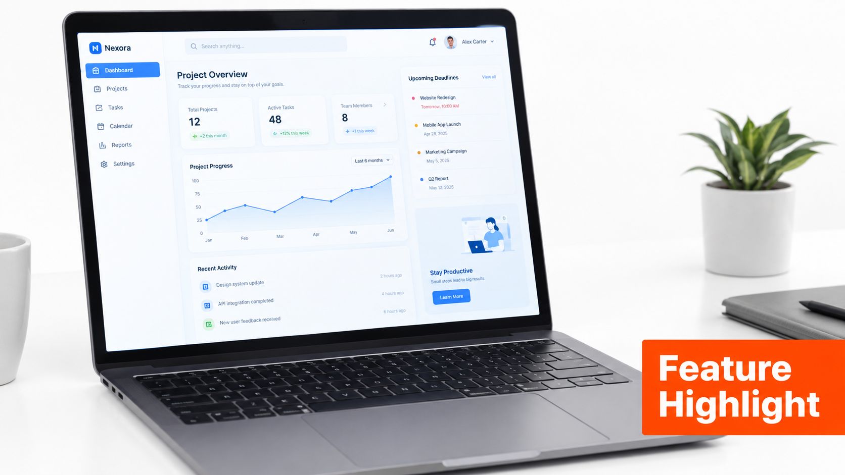
A product close-up makes a clear acquisition promise: viewers will see the interface, feature, or workflow featured in the video. That promise suits product demos, feature walkthroughs, software comparisons, and implementation tutorials, especially when recognition matters more than a dramatic claim.
Use the screen as evidence. Notion might show a database template, Zapier two connected apps, Airtable a field configuration, or Loom its recording and playback controls. Each example tells a prospective buyer what awaits them and helps filter for viewers who care about that product or task.
Make the feature readable at a glance
A full dashboard usually contains too much information for a thumbnail. Crop around the control or result that carries the video's main promise, mute unrelated panels, and let one visual marker guide attention. The asset should be built at YouTube's recommended 16:9 format, then checked at a small preview size.
A useful build sequence looks like this:
Choose one screen: Show the feature most closely tied to the video's title and buyer intent.
Crop tightly: Remove navigation, empty space, and controls that do not support the promise.
Mark one detail: Use a soft glow, outline, or restrained arrow. Several arrows turn a product demo into a scavenger hunt.
Keep the series recognisable: Consistent framing and colour treatment help returning viewers identify tutorials quickly.
The B2B trade-off is clarity versus excitement. A plain interface screenshot may earn fewer impulse clicks, yet it can attract better-qualified viewers. Heavy labels and oversized arrows may raise curiosity while making a serious software product look less credible.
Test the interface alone against a version with one short benefit label, such as “NEW WORKFLOW.” The first tests product recognition. The second tests whether viewers need the outcome stated before they click. Compare click-through rate with watch time, because a thumbnail that wins clicks but loses the opening promise is expensive attention.
Here's a practical example of the format in motion:
The image must still work without the player beside it. A thumbnail is an acquisition asset, not a tiny product manual.
4. The Split-Screen or Before-After Comparison
A split-screen thumbnail turns a business change into a quick visual argument. One side shows the problem, old method, or starting point. The other presents the improved state, alternative, or result. For a B2B viewer scanning YouTube on mobile, that contrast can communicate the video's promise before the title does much work.
Use this format for case studies, workflow improvements, landing-page reviews, and software comparisons. Examples include “MANUAL CRM” beside “AUTOMATED PIPELINE,” or “RANDOM POSTS” beside “PLANNED CALENDAR.” The two states need enough visual difference to remain clear at YouTube's recommended 16:9 format and at a small preview size.
Build the comparison around one buyer question
Choose the layout according to the change you want the viewer to understand. A vertical split is familiar and efficient. A diagonal divide adds motion for a transformation story, while a horizontal arrangement can suit a dashboard makeover or visual audit.
Use dark and light tones, or muted and bright treatments, to separate the states quickly. Add one centre cue, such as an arrow or check mark, only when the direction of change needs help. Keep labels to a few words, naming each state rather than explaining the entire process. Select recognisable images, such as a dashboard, chart, room, or object, because fine detail disappears after reduction.
The trade-off is comprehension versus accuracy. A genuine business transformation may involve several steps, but the thumbnail can show only the clearest contrast. Let the title define the scope, and avoid implying that one click created a complete consulting outcome.
For a B2B acquisition test, compare vertical and horizontal layouts while keeping the title, audience, and imagery consistent. You can also test labels against image-only versions. Track click-through rate alongside watch time. If both sides look equally messy, the format shows difference without giving viewers a reason to care.
5. The Human-Focused Thumbnail
A real face adds a person to an otherwise corporate subject. The face might belong to a founder, product expert, customer, interviewer, or analyst. For thought leadership and educational content, that human presence can make the video feel more accountable and easier to trust.
This format suits interviews, expert commentary, founder-led lessons, webinars, and opinion-led analysis. Patrick Bet-David uses a confident presence for Valuetainment. Lex Fridman's podcast thumbnails give guests visual prominence, while Ali Abdaal uses recognisable professional portraits with varied expressions.
A face alone isn't a strategy. The expression and surrounding context should match the video. A thoughtful expression fits an analytical topic. A focused expression supports a tactical lesson. A theatrical look can work for a surprising result, but constant shock eventually makes every business problem look like a fire alarm.
Make the person support the promise
Professional lighting and a consistent background help a channel build recognition. The face should remain large enough to identify, while leaving room for a short benefit or contextual object. A product screenshot, chart, or single keyword can explain why the person is present.
A B2B marketing lead building a channel strategy can also review this YouTube channel growth strategy alongside the thumbnail system. The visual identity should support the publishing plan, not operate as a collection of unrelated weekly emergencies.

YouTube's own thumbnail research guidance emphasises CTR as the acquisition measure, while independent analysis of 1,000 YouTube thumbnails reported an average 6.8% CTR for thumbnails with a human face compared with 4.1% without one, described as a 66% relative lift. The figures appear in the thumbnail study from CTR Pilot. That result shouldn't become a command to add a face to every upload. It supports a more useful test: compare a credible human-led version with a product or proof-led version when the subject allows both.
The main trade-off is authority versus sameness. A face can build recognition, but a channel with the same headshot, expression, and background on every upload may stop communicating the topic. The person should be recognisable, not the only thing viewers recognise.
6. The Curiosity Gap Thumbnail
A curiosity-gap thumbnail withholds part of the answer. It might show an incomplete result, a question, a hidden outcome, or a visual contradiction. Used carefully, it creates a reason to click without making a promise the video can't keep.
For B2B audiences, ethical intrigue is more useful than theatrical clickbait. A SaaS team might use “WE DITCHED X” beside a blurred tool interface. A founder interview could use “THE PART THEY OMITTED.” A case study might show “THIS SAVED US…” while the video explains the evidence and method.
Intrigue must have a receipt
The video should resolve the question. If the thumbnail teases a surprising change and the content spends the opening minutes discussing an unrelated topic, viewers will feel misled. That creates the wrong kind of click, one that can damage retention and trust.
Good curiosity designs often combine:
A specific unresolved question: Avoid vague lines such as “You Won't Believe This.”
One contextual object: Show the dashboard, document, product, or chart connected to the mystery.
A restrained visual cue: One question mark, highlight box, or arrow is usually enough.
A real insight: Use the format for lessons learned, case studies, and industry analysis with substance behind the tease.
A professional woman beside an “Expert Advice” panel can signal authority without revealing the entire lesson.

The same promise discipline applies to SEO video optimisation. Search relevance can earn the impression, but the thumbnail still needs to make a qualified viewer curious enough to choose the video.
The trade-off is CTR versus watch-time quality. Recent coverage argues that YouTube increasingly favours thumbnails that don't overpromise, because inflated clicks can be weakened when retention underperforms, as discussed in thumbnail trends for 2026. For educational, finance, and B2B videos, a slightly quieter promise may bring fewer empty clicks and more viewers who stay for the answer.
7. The Strategic Colour Blocking
Colour blocking replaces visual clutter with large areas of solid colour, minimal text, and a small number of icons or shapes. It can look premium, modern, and deliberate, especially when the subject itself is abstract or the channel has strong brand colours.
Apple often uses restrained product-led compositions, while Mailchimp can use playful blocks without losing structure. Software teams can borrow the approach from design systems, pairing a primary brand colour with a complementary accent and generous neutral space.
Let contrast carry the layout
A colour-blocked thumbnail needs hierarchy because it has fewer objects to do the work. One word, icon, or product crop should receive the most attention. A diagonal or layered split often feels more dynamic than a rigid 50/50 division, while a neutral area gives the eye somewhere to rest.
Useful tests include:
Test two-colour and three-colour versions: More colour isn't automatically more energy.
Check accessibility: Text needs enough contrast against the block behind it.
Try a neutral field: White, charcoal, or another quiet tone can separate a strong brand colour from the feed.
Use one short phrase: “AI WORKFLOW” says more than a paragraph squeezed into a blue rectangle.
A product marketing team might use a deep blue block, a small interface crop, and the phrase “BUILD FASTER.” A strategy channel could use an orange diagonal against charcoal with one large question mark. The design stays simple, but the message still needs a clear business reason to click.
The trade-off is distinctiveness versus emotional intensity. Colour blocking can stand out among busy thumbnails, but it may feel too calm for a dramatic case study or urgent news analysis. It performs best when the brand wants to communicate focus, confidence, and control. If the result looks like a presentation cover that wandered onto YouTube, the composition needs a stronger focal point.
8. The Branded Icon or Logo Integration
A branded thumbnail system makes a channel recognisable across a series of uploads. The system can use a repeatable palette, icon style, typography, shape language, and modest logo treatment. The purpose isn't to make every image identical. It's to make the channel feel like one useful publication rather than eight unrelated design experiments.
Loom uses a mint-green accent and simple icon language. Slack leans on purple and geometric forms, while Figma and Intercom maintain recognisable visual treatments across educational content. Stripe's black-and-white approach shows that a brand system doesn't need loud colours to be visible.
Build a system that leaves room for the topic
A thumbnail guide should define a handful of variations rather than trap every video in one layout. A product demo may need an interface close-up. An interview may need a face. A strategy lesson may work better with a number or question. The system can connect them through typography, colour, and spacing.
Limit the palette: Brand colours and neutrals should remain easy to manage.
Create reusable icons: Industry-specific symbols can reduce production time and improve recognition.
Use the logo lightly: The logo should support identification, not occupy the entire frame.
Test in grayscale: A strong system should remain distinct even when colour is removed.
The trade-off is recognition versus flexibility. A strict template speeds production but can make every subject look interchangeable. A modular system preserves the brand while allowing the visual promise to change with the video.
Teams that need recurring production can consider a YouTube video editing service that includes thumbnail workflows. The useful question isn't whether a vendor can place a logo on an image. It's whether the team can maintain a consistent testing process across scripts, edits, titles, and thumbnails.
A branded system becomes especially valuable when several people publish on the same channel. It gives designers, editors, and subject-matter experts a shared visual language, which prevents the classic B2B outcome: a technically excellent video wearing a thumbnail assembled from six different opinions.
8-Point YouTube Thumbnail Design Comparison
Thumbnail Type | Implementation Complexity | Resource Requirements | Expected Outcomes | Ideal Use Cases | Key Advantages
The Bold Text Overlay with High Contrast | Low | Low, bold fonts, color contrast, small icon | Clear, fast-to-scan thumbnails; improved CTR on mobile | B2B how-tos, benefit-driven videos, short hooks | Highly readable at small sizes; quick to produce and A/B test
The Number or Statistic Highlight (Data-Driven Design) | Low–Medium | Low, validated stat, strong typography, simple background | High perceived credibility and immediate value signaling | Case studies, ROI breakdowns, benchmark reports | Conveys objective proof quickly; appeals to data-focused viewers
The Product or Feature Close-Up (Visual Recognition) | Medium | Medium, high-res screenshots or product shots, UI testing | Strong recognition and reduced purchase hesitation; better demo conversion | Product demos, feature walkthroughs, tool comparisons | Clearly shows the product; builds trust through transparency
The Split-Screen or Before-After Comparison | Medium | Medium, two distinct visuals, clear divider/labels | Immediate sense of transformation or contrast; engaging at glance | Comparisons, transformations, methodology vs. outcome videos | Visually communicates change; easy to understand across languages
The Human-Focused Thumbnail (Face, Emotion, Authority) | Medium | Medium–High, consistent headshots, lighting, expressions | Builds authority and channel loyalty; higher engagement over time | Interviews, thought leadership, expert advice | Emotional connection and recognizability; increases return views
The Curiosity Gap (Pattern Interrupt) Thumbnail | Low–Medium | Low, teasing copy, expressive faces or icons | Can significantly boost CTR if the video delivers on the tease; risk of drop-off if misleading | Thought leadership, lessons learned, teaser-style content | Highly engaging and shareable; encourages clicks through intrigue
The Strategic Color Blocking (Minimalist Composition) | Medium | Low–Medium, bold color blocks, brand palette, minimal text | Premium, distinctive look that scales well at small sizes | Brand storytelling, evergreen content, industry overviews | Clean, modern aesthetic; stands out amid cluttered feeds
The Branded Icon or Logo Integration (System-Level Design) | High | High, design system, icon set, templates, governance | Consistent brand recognition and scalable thumbnail production | Large channels, educational series, multi-campaign brands | Strong brand recall; efficient for large-scale, repeatable publishing
Turn Eight Styles Into a Testing System
Each style has a different acquisition job. Bold text gives a fast answer to “Why should this viewer care?” Statistics provide proof when the evidence is real. Product close-ups identify the tool and suit demos. Split screens show transformation or comparison. Human-focused designs build authority around an expert. Curiosity gaps create earned intrigue. Colour blocking offers standout simplicity. Branded systems build recognition across a publishing programme.
YouTube-wide benchmark summaries commonly describe CTR in a broad 2% to 10% range, with around 3% to 4% often treated as average and 5% to 7% as strong, although the figures vary by traffic source, niche, and video type. The benchmark context appears in this YouTube CTR summary. A B2B team should treat those ranges as orientation, not a universal target. The most useful comparison is the channel's own historical baseline and the quality of the viewers who stay.
A compact workflow for every upload
Choose one video goal: Decide whether the video needs discovery, qualified product interest, authority, or a clear transformation.
Choose the matching style: Don't force a statistic onto an interview or a face onto a feature walkthrough just because another channel does it.
Create two materially different concepts: Change the visual idea, not just the font colour. For example, compare a product close-up with a bold benefit overlay.
Check both at small size: Preview the designs on a phone and remove anything that becomes unreadable or ambiguous.
Keep the title and audience constant: Otherwise the test has too many moving parts.
Compare available signals: Look at impressions CTR alongside watch-time and retention signals. The highest click rate isn't automatically the best business result.
Document the pattern: Record the promise, focal point, layout, and audience response so future thumbnails improve through learning rather than memory.
YouTube's recommended technical frame is 1,280 × 720 pixels, with a minimum width of 640 pixels, and a 16:9 aspect ratio, according to YouTube's official thumbnail specifications. Adobe also outlines the standard YouTube thumbnail size and format. The design should survive mobile, desktop, and TV previews without relying on tiny details.
Frequently asked questions
What are the YouTube thumbnail dimensions and aspect ratio
The standard format is 1,280 × 720 pixels with a 16:9 aspect ratio. YouTube also lists a minimum width of 640 pixels. A thumbnail designed in that frame gives the composition enough room to scale across viewing surfaces.
How much text should a YouTube thumbnail use
Use as little as the promise requires. Around three words is a useful mobile-readability target, and a short phrase is usually stronger than a sentence. Product close-ups, clear comparisons, and strong visual results may work without text.
When should a thumbnail show a face
Show a face when the video's value comes from a person's judgment, experience, interview, or reaction. A face is less useful when it competes with a product interface or hides the transformation the viewer needs to see. The subject should explain the promise, not merely decorate it.
Do statistics on thumbnails need verification
Yes. Every number should be genuine, relevant, and explained in the video or supporting material. A verified statistic can create a strong reason to watch. An invented figure can attract the wrong audience and undermine the channel's credibility.
How should a B2B team choose a thumbnail template
Start with the acquisition goal and the video format. Use bold text for fast clarity, a number for documented proof, a product close-up for demos, a split screen for change, a face for authority, a curiosity gap for a real unresolved question, colour blocking for minimalist differentiation, and a branded system for repeatable recognition.
Eligible pages can add FAQPage, Article, and BreadcrumbList schema where the visible content supports those types and the implementation follows search-engine guidelines. Schema won't repair a weak promise, but it can help search systems interpret a properly structured article.
A B2B team that needs strategy, scripting, thumbnail design, editing, SEO, and ongoing creative testing under one roof can evaluate ContentBuck as one production option. ContentBuck supports YouTube growth work, including thumbnail design and variations, alongside broader video-led acquisition services. Teams that need sharper source assets can also review how to upscale YouTube thumbnails, provided the final image remains clear, honest, and readable.
The right template isn't the one that looks most impressive in a design review. It's the one that communicates the video's value quickly, attracts the intended buyer, and continues to work when the next upload arrives. A thumbnail should earn attention without borrowing trust from the content.
ContentBuck helps B2B teams build YouTube acquisition systems with strategy, scripting, editing, SEO, custom thumbnail design, and ongoing creative testing. Teams can visit ContentBuck to explore a practical way to turn these thumbnail styles into a repeatable publishing workflow.
Parth Jasrapuria
Founder at ContentBuck
Building video systems for B2B businesses. Obsessed with YouTube growth, creative strategy, and organic SEO.