Conversion Focused Website Design for B2B Growth
Parth Jasrapuria
Founder
Changing a B2B website's button from blue to orange won't rescue a funnel with unclear messaging, slow interactions, and a demo form that feels like a tax return. Conversion focused website design treats the site as a measurable path toward a business action, not a digital brochure with decorative navigation.
A conversion can mean a purchase, membership registration, catalogue download, consultation request, or demo booking. The calculation is simple: conversions divided by visitors. If 1,000 purchases come from 100,000 visitors, the conversion rate is 1%, as explained by the BDC conversion rate glossary.
Why Most B2B Websites Fail at Converting Traffic
The popular advice usually starts with button colour. That advice is convenient because it's easy to discuss in a meeting, easy to mock up, and unlikely to upset the legal department. It's also rarely the main reason a qualified buyer abandons a B2B site.
The larger problem is structural. Visitors often land on a page that describes what the company does, but not who it helps, which problem it solves, what proof exists, or what action should happen next. A hero headline says “Transforming Business Through Innovation,” a navigation menu contains seventeen options, and the demo button says “Submit.” Somewhere, a buyer closes the tab.
Conversion-focused design emerged as a measurable discipline in the early 2000s. Increased competition and improved website analytics encouraged marketers to test layouts, copy, offers, and imagery instead of trusting personal taste. 2004 is widely cited as a milestone for more accessible experimentation, while Google Website Optimizer launched in 2007, helping make A/B testing broadly available through the development of conversion rate optimization.
Design for actions, not applause
A polished interface can support conversion, but visual polish isn't the definition. The central question is whether each important page helps a suitable visitor complete the next useful action with confidence.
A B2B homepage might guide different audiences toward a product tour, an industry page, a technical resource, or a sales conversation. That doesn't mean every path needs a separate pop-up, chatbot, and animated arrow. It means the information architecture should reflect buyer intent instead of the internal org chart.
Practical rule: If a page has several audiences, make their next steps obvious. Don't force every visitor through the same “Book a Demo” door.
The business case for fixing the experience is substantial. One cited source reports that great UX can drive conversion rates by up to 400%, while another reports that well-executed UX can boost conversions by up to 200%, according to web design statistics compiled by Hostinger. Those figures don't promise a result for every redesign. They do show why usability deserves more attention than a committee debate about whether a button should have a six-pixel radius or eight.
A practical review should begin with the leakiest step in the journey. Is the visitor arriving on the wrong page? Is the offer unclear? Does the form ask for information sales doesn't use? Does the page become interactive only after the buyer has already given up? A conversion focused website design process answers those questions with evidence, then turns the findings into page and flow changes.
For a broader B2B perspective on discoverability and buyer journeys, the B2B website design guide for ranking in ChatGPT offers useful context. Search visibility matters, but traffic is only valuable when the destination page can convert the intent behind it.
Structuring Information Architecture and Core Messaging
A B2B site should make sense to a buyer who has never attended an internal strategy meeting. That sounds obvious, yet many websites organise services according to departments, product names, or historical acquisitions. Buyers don't care which team owns “Business Transformation Solutions.” They want to know whether the company can solve a costly problem in their world.
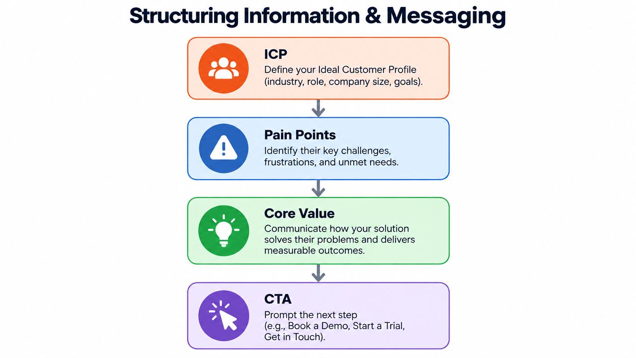
Start with the ideal customer profile, then map the questions that profile asks before contacting sales. A finance leader may need implementation detail and risk information. A marketing leader may want speed, integrations, and evidence of pipeline impact. A technical evaluator may search for security documentation. Each audience can share a conversion path without receiving identical copy.
Build the site around buyer intent
A useful information architecture usually follows a simple progression:
Pain point: Name the operational problem in language buyers already use.
Core value: Explain the business outcome and how the product or service creates it.
Proof: Show relevant evidence, process detail, customer examples, or technical reassurance.
Action: Offer the next step that matches the visitor's readiness.
That structure doesn't require every page to become a sales pitch. An educational article may lead to a comparison guide. A product page may lead to a trial or demo. A security page may lead to a technical review. The mistake is giving every page the same primary CTA, then wondering why the analytics show plenty of clicks and very little intent.
Plain language improves the path. “Reduce manual invoice reconciliation” says more than “Power intelligent finance workflows.” “Get a security review” is clearer than “Explore our trust ecosystem.” Corporate jargon often tries to sound safe, but it creates the same effect as fog on a motorway. The words are present, and nobody can see where to go.
Benchmarking also needs discipline. Ecommerce conversion rates are often cited around 2.5% to 3%, with one cited average of 2.91%, but that benchmark isn't suitable for every B2B page. Unbounce's analysis of 41,000 landing pages found a 6.6% median conversion rate across industries, while the 75th-percentile floor begins around 11.4%. SaaS has a lower benchmark of about 3.8%, according to the landing page benchmark summary from DesignRush.
Match the benchmark to the page
A homepage, pricing page, webinar registration page, and demo landing page have different jobs. Traffic source and device also change the meaning of the result. A paid campaign landing page should be judged against comparable campaign pages, not against a broad site average.
Consider a SaaS company whose navigation labels its product by internal modules. Replacing those labels with buyer-facing categories such as “Automate reporting,” “Manage approvals,” and “Connect your data” gives visitors a faster mental map. The redesign doesn't need more content. It needs a clearer route through the content already available.
Designing High Converting Hero Sections and Demo Pages
A hero section does not need a louder CTA button. It needs to remove uncertainty before the visitor starts scrolling. In seconds, buyers should understand who the product serves, which problem it addresses, and what happens after the click. A headline that merely repeats the company name wastes the page's most valuable space.
Write the hero around a specific audience, a costly problem or useful outcome, and a CTA that names the next step. “Security automation for growing SaaS teams” gives buyers more to work with than “The future of enterprise protection.” Supporting copy can explain the mechanism, integrations, or proof. Keep it brief. A hero is not the place to publish the company's annual report.

Above-the-fold clutter creates another leak. Logos, testimonials, product screenshots, feature cards, a calendar widget, multiple videos, and a chatbot may each have a role. Placing them together makes the page feel like an entire sales team greeting one visitor at the door.
Landing pages with fewer than 10 elements convert at roughly twice the rate of pages with 40 or more elements, according to landing page statistics from Sender. That does not mean stripping every page down to a headline and button. Remove elements that do not improve understanding, trust, or action. The right question is whether each block earns its space.
Make the CTA describe the commitment
“Submit” creates work without explaining the reward. “See the workflow,” “Request a technical review,” and “Book a product fit call” set clearer expectations. A personalised CTA should reflect the page context and likely buyer intent. Adding a visitor's first name to a button is not personalisation. Matching the request to the decision the buyer is trying to make is.
Demo pages should answer practical questions before requesting contact details:
Who is the session for?
What will the buyer see?
How long will the conversation take, if that is known?
What happens after the form?
A short VSL can explain an unfamiliar workflow faster than dense copy, especially when several user groups are involved. Use the landing page copy and UX guide to align the promise, page structure, and user expectations. Keep the video focused on the central question. An unskippable cinematic intro is still a delay, no matter how expensive the production was.
Use this guide to using videos on landing pages to decide whether video resolves a specific point of confusion or just adds weight. Place it near the explanation buyers need, not automatically at the top of every page.
Keep the promise consistent from search result or ad to form confirmation. If the headline says “Automate monthly reporting,” the form and confirmation page should use the same concrete language. Consistency makes the next action feel expected rather than suspicious. It also leaves less room for AI-generated personalisation to introduce claims or wording that the buyer never saw in the original message.
Eliminating Form Friction and Hitting Speed Thresholds
B2B teams often treat speed as a technical concern and forms as a marketing concern. Buyers experience both as one thing: effort. A slow page delays the first interaction, while an overbuilt form asks the visitor to do unpaid data entry before earning a useful conversation.
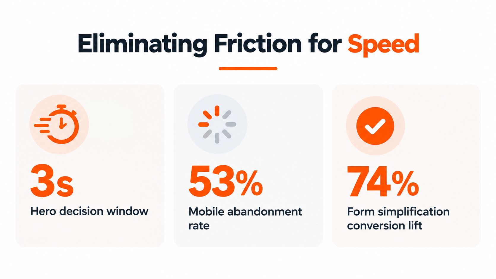
Core Web Vitals make that relationship more concrete. Recent coverage reports that every 1-second delay in LCP can cut conversion rate by 11.4% on the median site, while sites with sub-1.5-second LCP convert at 2.7 times the rate of sites above 6 seconds. The same source reports that INP above 200 milliseconds can reduce conversion rate by 23%, as detailed in conversion-focused performance guidance from Silva Marketing.
LCP, or Largest Contentful Paint, measures when the main visible content appears. INP, or Interaction to Next Paint, reflects how quickly the page responds after a visitor clicks, taps, or types. For a B2B site, that interaction might be opening a pricing panel, selecting a form option, starting a call, or submitting a demo request.
Fix the interaction before decorating the form
Performance work should focus on the pages that carry commercial intent. Compress oversized hero media, defer non-essential scripts, reduce third-party widgets, and test the actual form interaction on ordinary mobile connections. A page can look fast in a designer's office and behave like wet cement for a buyer using a phone in an airport.
Forms need the same ruthless editing. Ask only for information that changes routing, qualification, or follow-up. If sales doesn't use a field, remove it. If a field creates useful context but feels intrusive at the first step, place it later in a progressive flow.
A two-step flow can make the commitment feel smaller because the visitor starts with an easy action before seeing the complete qualification process. One redesign using a two-step flow reported a 54% relative increase in conversion, while a separate usability-led redesign reported a 385% rise in weekly booked calls after testing and analytics identified friction points, according to MarketingSherpa's web design case studies.
Conversion insight: A form isn't a questionnaire. It's a negotiation. The company earns additional information by making the first step clear and worthwhile.
A useful B2B form might begin with work email and company, then ask about the problem or buying timeline after the visitor has continued. The exact fields depend on the sales process, but the principle stays consistent. Qualification should help the buyer reach the right conversation, not punish the buyer for being interested.
The SaaS homepage above-the-fold guide can help teams review whether the opening screen earns attention before the form asks for commitment. Speed and form design should be tested together because a fast page with a hostile form still loses leads, and a short form on a sluggish page still makes buyers wait.
Running A/B Tests and Deploying AI Personalization
Conversion testing should target decisions, not decoration. A red button against a green one may produce a tidy chart, but it rarely answers why a B2B buyer hesitated. Test whether proof belongs before the demo request, whether a clearer offer removes doubt, or whether a shorter path increases completed bookings.
A significant result is the exception, not the default. Treat each test as a hypothesis: identify one major variable, define the primary conversion, choose the audience and measurement window, then record the outcome whether the variant wins or loses. Small traffic volumes make weak conclusions especially dangerous, so avoid declaring victory after a handful of conversions.
Measure the revenue path
Analytics should connect page behaviour with sales outcomes. Track the source, landing page, CTA interaction, form start, form completion, booked meeting, qualified opportunity, and later revenue stage where the systems allow it. A click signals interest. It does not establish commercial value.
Use this testing sequence:
Find a high-value page with a meaningful drop-off.
Review recordings, form analytics, search terms, and sales feedback.
Write a hypothesis tied to a specific buyer objection.
Change the headline, proof, offer, flow, or interaction that addresses it.
Run the test long enough to collect useful evidence, then document the result.
CRO case studies for agencies show how observation and testing can expose problems a visual review misses. The practical lesson is to study the link between behaviour and intervention, not copy another company's winning layout. A polished redesign can still fail if it changes too many variables to explain the result.
AI personalization needs the same discipline. Dynamic copy can adapt to industry, role, or declared use case. A conversational interface can help visitors find documentation or qualify a request. It can also create a trust gap if the buyer cannot tell why the message changed, what information shaped it, or whether a human remains available.
Recent CRO coverage identifies AI personalization, zero-party data, micro-moment optimization, and AI search as major 2026 directions, while emphasising measurement and data quality. It also discusses reports of AI-powered CRO improving conversion rates by up to 25%, as covered by WebFX's CRO trends coverage. Treat that figure as directional evidence, not permission to add a chatbot to every page.
Technical experience belongs in the experiment plan too. If a personalized block delays the largest visible content and pushes LCP beyond the Core Web Vitals threshold, or adds scripts that worsen INP, the extra relevance may cost more conversions than it creates. Measure the personalized and control experiences separately on representative devices and connections.
Give buyers a clear way to reach a human or a direct resource. Personalization should explain itself through relevance and consistency, not surprise. When the system hides pricing context, invents proof, or traps a serious buyer in chat, novelty has replaced confidence.
Implementation Checklist and Frequently Asked Questions
A redesign should earn its launch by surviving a practical review, not by winning an internal beauty contest. Before deployment, a B2B team should verify that the page promise, technical experience, form, analytics, and follow-up process all agree.
A final checklist should include:
Audit ICP alignment: Confirm that the headline, proof, navigation, and CTA match a real buyer and use case.
Simplify hero copy: Remove abstract claims and state the problem, outcome, and next step.
Reduce form fields to 3: Keep the first interaction focused, then collect more detail only when it improves routing.
Verify LCP under 2.5s: Test the commercial pages on representative devices and connections.
Test mobile CTAs: Check tap targets, sticky actions, phone links, validation messages, and keyboard behaviour.
Frequently asked questions
What is conversion focused website design?
It's the practice of designing pages and user journeys around measurable actions, such as requesting a demo, booking a consultation, downloading a resource, or starting a trial. Visual design supports the experience, but messaging, structure, speed, trust, and friction determine whether visitors move forward.
How many fields should a B2B demo form have?
There isn't one universal number. A practical starting point is a short first step that asks for information necessary to identify and route the request, with additional qualification later if sales genuinely uses it.
Should every B2B site use an AI chatbot?
No. AI chat works when visitors need help finding information or describing a complex requirement. It can hurt conversion when it delays a direct answer, obscures pricing or proof, creates uncertainty about data use, or replaces a simple form with an unnecessarily theatrical conversation.
Does FAQ schema still matter?
FAQ content should first serve visitors by answering objections directly. Guidance on FAQ page templates and implementation recommends matching FAQPage structured data to visible page content and using JSON-LD, even though Google doesn't show FAQ rich results as often as it once did. Answers should stay concise, use question-based headings, and group topics by intent. Practical FAQ guidance commonly recommends answers of about 40 to 80 words, as described in FAQ template recommendations from WebPeak.
A page that passes this checklist has a better chance of converting because it removes the quiet obstacles that button-colour debates miss. The work continues after launch through measurement, customer feedback, sales observations, and focused experiments.
ContentBuck helps B2B teams connect conversion-focused website design with video-led acquisition through animated explainers, VSL scripting, ad creative, SEO content, and optional website design and development. Visit ContentBuck to turn complex products into clearer buyer journeys and stronger conversion paths.
Parth Jasrapuria
Founder at ContentBuck
Building video systems for B2B businesses. Obsessed with YouTube growth, creative strategy, and organic SEO.