Website Design for B2B That Get Ranked in ChatGPT Guide
Parth Jasrapuria
Founder
A procurement lead opens a vendor's website at 9:14 p.m., reads three pages, checks a comparison result, and leaves. The sales team never gets a chance to deliver its carefully prepared introduction. Somewhere, a salesperson is refreshing the CRM and asking whether “no response” means “not now” or “please never email again.”
That scene reflects a larger change in B2B buying. A 2026 research roundup says buyers spend only about 17% of the total purchase journey in direct contact with suppliers, while roughly 80% of decision shaping happens independently of sales. The same source reports that 61% of B2B buyers prefer a rep-free buying experience. (Consensus buyer behavior research)
For B2B companies, the website now carries part of the sales conversation. The homepage must explain the category. Product pages must answer practical questions. Proof must appear before a buyer starts hunting for it. Navigation must feel less like a maze and more like a helpful colleague who knows where the useful document is.
ChatGPT adds another layer. Google still sends far more visitors, but AI-assisted research can influence which companies enter a buyer's shortlist. Website design for B2B that gets ranked in ChatGPT isn't a collection of magic formatting tricks. It's buyer-first design made easy for search systems and AI tools to understand.
A practical guide such as ChatGPT SEO for founders can help teams think about that wider visibility problem. The central lesson is simple: build pages that answer real buyer questions clearly, support claims with evidence, and make the next step obvious. Humans appreciate that approach. Machines can parse it. Sales teams may even receive fewer ghostly calendar invites from themselves.
Introduction Why Your B2B Website Must Win Buyers and AI
A traditional B2B website often behaves like a printed brochure. It presents a polished logo, a grand mission statement, several photos of smiling people near glass walls, and a button saying “Talk to an expert.” The buyer, meanwhile, wants to know whether the product fits the current system, what it replaces, how implementation works, and whether the price will cause an internal budgeting meeting to become a small hostage situation.
Modern buyers usually begin with questions, not brand admiration. They search for solutions, compare vendors, read reviews, inspect product details, and look for evidence before contacting sales. If the website answers those questions quickly, the buyer can move forward independently. If it hides the answers behind vague language or a lengthy form, the buyer can move forward independently too, straight to a competitor.
That's why B2B website design now has three jobs:
Explain the offer: State who the product serves, which problem it solves, and how it works.
Support evaluation: Provide comparisons, use cases, implementation details, security information, pricing guidance, and proof.
Create a sensible action: Offer a demo, trial, consultation, calculator, or contact route that matches the buyer's readiness.
AI visibility grows from the same foundation. A page with clear headings, focused answers, meaningful internal links, and trustworthy supporting information gives ChatGPT-like systems easier material to interpret. A page stuffed with broad claims and decorative language gives everyone less to work with, including the poor human who only wanted to understand the product.
Practical rule: If a buyer can't find the answer without sales help, an AI system may struggle to find and present it too.
The rest of the guide treats ChatGPT visibility as an outcome of useful architecture. It covers intent mapping, answer-first page structure, authority, technical choices, conversion paths, and realistic examples. The objective isn't to make a website sound like a robot wrote it. The objective is to make the website so clear that both a busy buyer and an AI assistant can understand its value without an archaeological expedition.
How Buyer Intent Architecture Shapes B2B Website Design
A useful B2B website resembles a well-organized hardware store. The signs are visible, related products sit near each other, and a visitor can move from “I need to fix this” to “this is the right tool” without climbing through a box marked “miscellaneous.”
A brochure site resembles a warehouse after a team-building exercise. Everything may be present, but the visitor has to move boxes, ask for help, and wonder why the pricing page is hiding behind a button called “Discover Possibilities.”
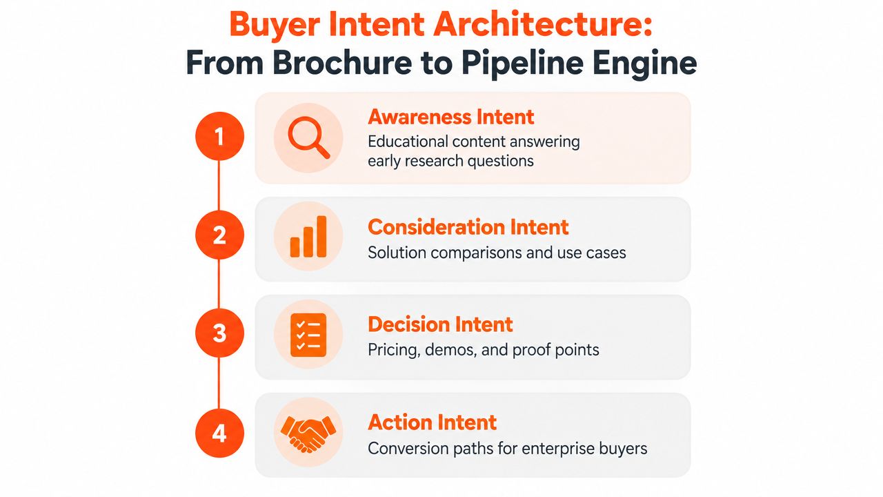
Buyer-intent architecture organizes pages around the questions buyers ask at different stages. It replaces a company-first structure with a research-first structure.
Map questions to page types
Start by listing the questions a buyer asks, then connect each question to a page that answers it.
Awareness pages answer problem-focused questions. Examples include guides, glossaries, explainer videos, and diagnostic checklists.
Consideration pages help buyers compare approaches. Examples include product comparisons, use-case pages, category pages, and integration explanations.
Decision pages reduce perceived risk. Examples include pricing, security, implementation, customer stories, product tours, and detailed feature pages.
Action pages make the next step easy. Examples include demo scheduling, trial signup, consultation forms, and contact routes.
This hierarchy helps humans because it follows their thought process. It helps AI systems because each page has a clear purpose and topical boundary. A comparison page should compare. A security page should explain security. A homepage should not attempt to answer every question ever asked by a procurement department with a coffee shortage.
Build clear paths between related pages
Internal links should guide visitors from broad questions to specific decisions. An article about reducing manual reporting can link to a reporting product page, a relevant integration page, and an implementation guide. The product page can link back to the educational article and forward to proof or demo options.
Place the main value proposition and supporting proof where visitors can see them early. Don't force a buyer to scroll through three paragraphs about company values before learning what the software does. Clear H2 and H3 headings also create useful signposts for AI retrieval.
A website earns attention by reducing the number of questions a buyer must ask elsewhere.
The result is a site that behaves like a helpful information system, not a digital reception desk that keeps saying, “Please book a call to find out.”
How ChatGPT Chooses Which B2B Websites to Cite
ChatGPT visibility deserves realistic expectations. In 2026, Ahrefs reported that Google sends about 190 times more traffic to websites than ChatGPT. Google accounts for nearly 40% of website traffic, while ChatGPT contributed 0.21%. Semrush also reported that outbound referral traffic from ChatGPT to the wider web grew 206% in 2025. (Ahrefs analysis of ChatGPT referrals)
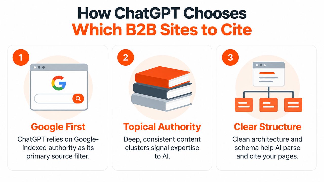
Those figures point in two directions. Google remains the main traffic engine, so traditional SEO, crawlability, useful content, and strong technical performance still matter. ChatGPT referrals are smaller, but their growth shows that AI assistants have become a meaningful research layer rather than a novelty reserved for people asking computers to write pirate poetry.
A page can improve its chances of being cited by making its answer easy to locate and verify.
Use answer-first page structure
A study of 16,851 queries found that pages ranking well and using headings closely matched to the query were cited more often. The same analysis reported a higher citation rate for JSON-LD markup, 38.5% compared with 32.0%, and found that articles with 4 to 10 subheadings performed best. Pages in the 500 to 2,000-word range outperformed very short or very long pages. (ChatGPT source selection analysis)
For a B2B service page, that suggests a practical layout:
State the direct answer near the top.
Use headings that match buyer questions.
Explain the process in short sections.
Add proof close to the relevant claim.
Finish with a clear, low-friction next step.
Structured data can help machines interpret page meaning, but it can't rescue unclear content. A Product schema block won't turn “We help businesses achieve transformational growth” into a product explanation. It will merely give that sentence a more organized hat.
Treat authority and freshness as connected
A 129,000-domain analysis found that referring domains were the strongest predictor of citation likelihood. Another analysis reported that pages published 30 to 89 days earlier performed best, while content newer than 30 days underperformed. (Search Engine Journal analysis of ChatGPT citations)
The design implication is broader than adding schema. High-value pages need to be crawlable, internally linked, connected to the site's main topic, supported by credible external mentions, and refreshed when the product or market changes.
For another practical explanation of why AI systems may ignore otherwise decent websites, readers can review how Outrank solves site skips. Teams can also examine this guide to ranking in ChatGPT for additional context on content and visibility.
The sensible strategy is layered. Build for Google first, make information easy for humans to scan, then add structured and authority signals that help AI systems understand the same material. ChatGPT is an emerging channel, not a replacement for search, sound information architecture, or a page that explains what the company sells.
Designing Conversion Paths That Enterprise Buyers Actually Use
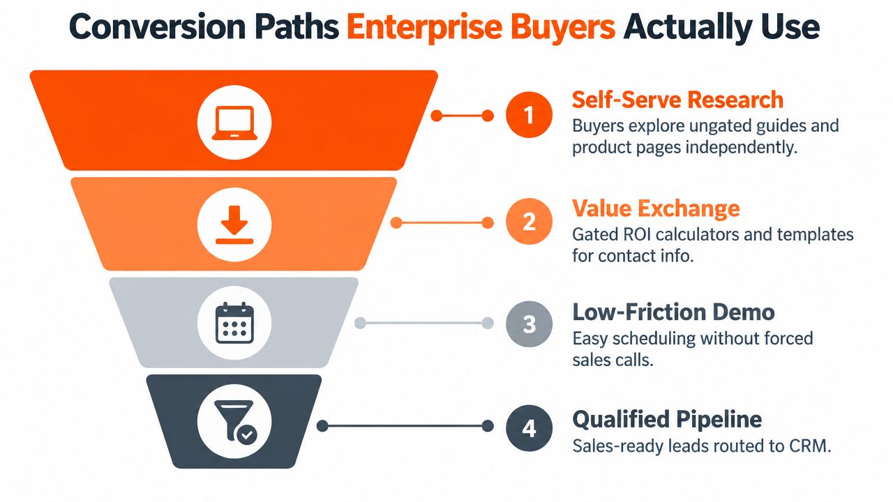
Enterprise buyers often want independence before they want interaction. They may read product pages during a quiet afternoon, share a security page with an IT colleague, send pricing guidance to finance, and only then agree to a conversation. A website that demands a sales call before providing basic context turns every curious visitor into a negotiation over information.
The strongest conversion paths offer different actions for different levels of readiness. A researcher might download a template. A qualified buyer might schedule a demo. A technical evaluator might need documentation or an integration guide. Each person should see a useful next step, not the same oversized orange button shouting “BOOK NOW” like it's late for an appointment.
Give each page a job
The homepage should communicate the category, audience, problem, differentiator, and primary action without making visitors decode a slogan. A product page should show the workflow, major capabilities, integrations, limitations, and proof. A case study should connect the customer's problem to the approach and outcome, using specific operational detail rather than a parade of adjectives.
Comparison pages deserve special care. Buyers may search for alternatives, product categories, or differences between approaches. A clear table can address those questions directly, while a short explanation can clarify which type of organization suits each option.
For SaaS teams refining the first screen of the homepage, this guide to what to put on a SaaS homepage above the fold offers a useful checklist.
Remove unnecessary friction
A demo form should ask only for information that helps route or prepare the conversation. If a visitor must provide a phone number, annual revenue, company size, favorite breakfast cereal, and the name of a childhood pet before seeing a calendar, the form has become a small tax audit.
Useful patterns include:
Short demo forms: Request essential qualification details, then let the buyer choose a time.
Self-serve evidence: Offer product tours, sample reports, security documentation, or implementation guides.
Helpful calculators: Let visitors estimate fit, effort, or potential value before requesting contact details.
Clear handoffs: Explain what happens after submission, including response expectations and who joins the call.
Alternative routes: Provide email, chat, trial, or documentation options where appropriate.
Conversion principle: The next step should feel like a continuation of research, not a punishment for having questions.
Enterprise design also benefits from proof near moments of uncertainty. Put customer logos, relevant outcomes, certifications, testimonials, or technical evidence beside the claim they support. A buyer shouldn't need to go to a mysterious “Trust Center” and hope the relevant document is inside.
Tech Stack and Integrations That Support SEO and AI Visibility
A practical stack should help a team publish, measure, connect, and refresh content. It shouldn't require a full-time engineer to change a heading or a monthly meeting to update a product description.
The right choice depends on the team's publishing habits, technical resources, CRM, and content complexity. A flexible CMS with clean templates may suit a lean SaaS company. A more controlled system may suit an organization with multiple regions, product lines, or approval workflows.
Component | What to Choose | Why It Matters
CMS | A system with editable metadata, headings, canonical controls, redirects, and structured content fields | Marketers can maintain pages without creating technical debt
Page templates | Reusable templates for product, use-case, comparison, case study, and resource pages | Consistent structure makes content easier to scan and maintain
Analytics | Analytics connected to Search Console and CRM reporting | Teams can connect discovery, engagement, and pipeline signals
Structured data | JSON-LD for relevant page types, validated before publishing | Clear markup helps machines interpret page content
Performance layer | Lightweight themes, compressed media, caching, and limited scripts | Faster pages support better user experiences and easier crawling
CRM integration | Forms and calendars connected to routing and lifecycle fields | Qualified actions reach the right sales process
Refresh workflow | Content ownership, review dates, and change logs | Important pages stay accurate and current
Authority workflow | Digital PR, expert contributions, useful research, and relationship building | External references support credibility beyond the company's own domain
Choose the simplest system that supports the workflow
A technically impressive stack can still fail if nobody uses it. The team should be able to publish a focused article, connect it to a product page, update outdated copy, and inspect performance without filing a ticket for every small change.
Structured data deserves a precise role. It can help machines understand content, but it doesn't guarantee a search feature or an AI citation. Google announced that FAQ rich results were deprecated in August 2023, and later stated that as of May 7, 2026, FAQ rich results no longer appear for most sites. FAQ structured data can remain in the code without causing problems, but teams shouldn't treat it as a ticket to guaranteed visibility. (Google FAQ rich result guidance)
For teams evaluating conversational features or other site integrations, this AI website integration guide provides relevant implementation context. A separate guide to getting a brand cited in AI models can help teams think beyond page markup and consider authority, content, and discoverability together.
Real World Examples of B2B Websites Built to Get Found
Consider two fictional companies based on common B2B website patterns. Their names are invented, but the situations will feel familiar to anyone who has watched a buyer hunt for a product explanation through six navigation menus.
Northstar Metrics makes the answer easy to find
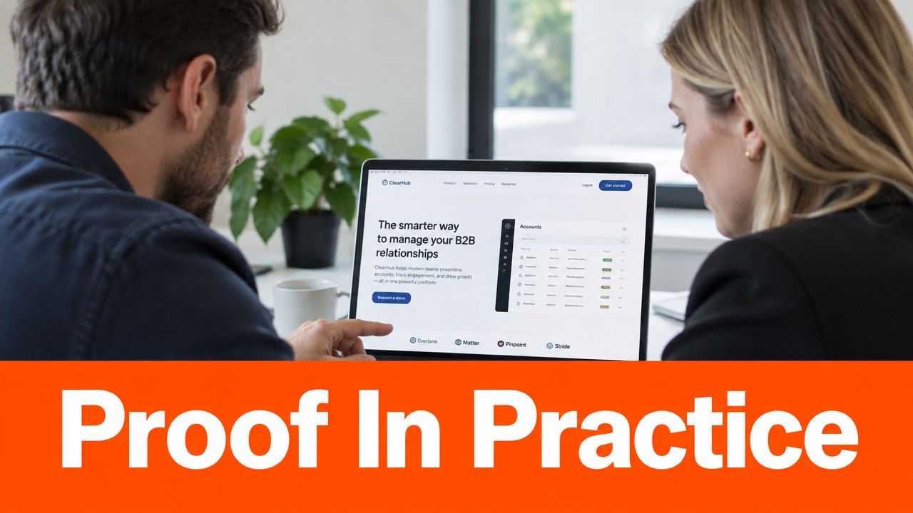
Northstar Metrics sells reporting software for operations teams. Its homepage opens with a direct explanation of the product, identifies the target users, and links to product capabilities, integrations, security information, customer examples, and pricing guidance.
Its content library follows buyer questions rather than internal departments. Articles about reporting workflows connect to use-case pages. Use-case pages link to product details and relevant proof. Comparison pages explain differences without pretending every competitor is a cartoon villain wearing a black cape.
The product pages use short sections with descriptive headings. Each page answers one clear question before moving to the next. A buyer can understand the basic value without a sales call, while an AI system has a clean set of topical passages to interpret.
The conversion path also matches intent. Early researchers can read guides. Evaluators can inspect integrations and security material. Decision-stage visitors can schedule a demo or request implementation information. The site doesn't trap every visitor in one funnel-shaped net.
HarborPoint Consulting hides the useful information
HarborPoint Consulting offers valuable operational services, but its homepage leads with an abstract promise about “unlocking human potential through connected transformation.” The visitor still doesn't know whether the firm provides consulting, software, outsourcing, or motivational posters for conference rooms.
The service pages bury the audience, problem, process, deliverables, and proof beneath long blocks of polished copy. Navigation uses labels such as “Solutions” and “Insights,” but visitors must guess which page applies to their situation. The only visible action is a general contact form with a demanding list of fields.
The firm may have strong expertise. The website makes that expertise difficult to retrieve. Search engines receive fewer clear signals about page intent, AI systems encounter fewer concise answers, and buyers face extra work before they can decide whether a conversation is worthwhile.
What the contrast teaches
The difference isn't visual polish. Both sites could use attractive colors, modern typography, and photographs of thoughtful people looking at laptops. The meaningful difference is information architecture aligned with buyer questions.
A B2B site built for humans and AI should make four things obvious:
Who the offer serves
Which problem it addresses
Why the approach is credible
What the buyer can do next
That clarity doesn't make a website boring. It makes the clever design serve the business instead of asking the buyer to admire it from a safe distance.
Your Next Steps to Launch a Website That Ranks and Converts
A useful launch plan starts with the buyer, not the redesign mood board. Teams should identify the questions that appear before sales involvement, map those questions to pages, and check whether each page gives a direct answer supported by evidence.
A practical launch sequence
First, audit the current experience. Ask a new visitor to find the product explanation, pricing guidance, security information, comparison content, proof, and demo route. Record every point where the visitor needs help. If the answer requires a guided tour from the person who built the navigation, the navigation needs work.
Next, rebuild the page hierarchy. Create clear clusters for educational content, use cases, comparisons, product details, proof, and conversion. Connect related pages with descriptive internal links. Keep the homepage focused instead of turning it into a buffet where every dish is labeled “Learn More.”
Then, improve page structure. Place the core answer near the top, use headings that reflect buyer questions, break long copy into readable sections, and add relevant JSON-LD where it accurately describes the page. Plain-language guidance from Newcastle University recommends sentences of no more than 20 words, active voice, a readability score of 60 or higher, and a grade level no greater than 9. (Newcastle University web content standards)
Finally, create a maintenance habit. Assign owners to high-value pages, review factual claims, update changed product details, strengthen internal links, and monitor both organic discovery and qualified actions. Teams can also test representative buyer prompts in ChatGPT, while remembering that AI responses can vary and shouldn't be treated like fixed search rankings.
Questions teams often ask
Does schema guarantee ChatGPT citations? No. Structured data can improve machine understanding, but relevance, clarity, crawlability, authority, and freshness also matter.
Should every page be long? No. The page should be as long as the buyer's question requires. The cited query study found a stronger performance range for focused pages rather than extremely short or extremely long content, but usefulness matters more than filling a word target.
Should a team stop focusing on Google? No. Google remains vastly larger as a traffic source. AI visibility should sit on top of solid technical SEO and useful website design.
What should be measured? Track organic entrances, engaged visits, demo starts, completed forms, qualified pipeline, assisted conversions, and the accuracy of AI descriptions when teams run prompt checks.
The strongest website design for B2B that gets ranked in ChatGPT begins with a less glamorous goal: answer the buyer's question before the buyer gives up.
ContentBuck helps B2B teams build buyer-intent SEO content, video-led proof, YouTube acquisition systems, and conversion-focused website experiences that make complex offers easier to understand. Visit ContentBuck to explore practical support for creating content and website systems that buyers and AI tools can find.
Parth Jasrapuria
Founder at ContentBuck
Building video systems for B2B businesses. Obsessed with YouTube growth, creative strategy, and organic SEO.