Explainer Video Animated Guide for B2B Growth
Parth Jasrapuria
Founder
A product marketer has spent weeks polishing a homepage. The interface looks elegant, the feature list is accurate, and the sales team knows the product inside out. Then a prospect asks, “So, what does it do?” The answer takes twelve minutes, three diagrams, and a heroic amount of hand waving.
That's the problem an explainer video animated for B2B audiences can solve. Animation turns invisible workflows, integrations, data movement, and abstract benefits into something a buyer can understand before a sales call. It isn't decoration. It's a visual shortcut through confusion.

Video has become a normal part of digital communication. Online video content reaches 92.3% of the world's internet users, and more than 1 billion hours of video are watched on YouTube each day, according to WebFX's video marketing statistics roundup. For B2B teams, that means the question isn't whether buyers watch video. It's whether the video makes the product easier to trust and easier to buy.
This guide breaks down what animated explainers are, which visual style fits which message, how production works, and how length changes across awareness, conversion, and onboarding. It also tackles the awkward question many teams avoid: should the video stay fully animated, or should it include live people, product screens, or both? Teams exploring the broader role of video can also use this resource on video marketing from Flexwork Podcast Studios for additional channel and strategy context.
Introduction Why Complex B2B Products Need Simple Stories
A B2B product often makes perfect sense to its creators and sounds like a puzzle assembled by committee to everyone else. “An orchestration layer for distributed revenue operations” may be accurate, but it doesn't give a buyer a useful picture. A good animated explainer replaces that fog with a simple sequence: this is the problem, this is what changes, and this is what the buyer can do next.
Consider a workflow platform that connects a CRM, billing system, support desk, and reporting tool. A text-heavy page might describe each integration separately. An animated video can show information moving between the systems, highlight where errors occur, and reveal the central dashboard as the place where the team regains control. The viewer doesn't need to mentally build the diagram. The video builds it for them.
Practical rule: If a sales representative has to draw the same explanation repeatedly, the product probably needs a visual explanation that works before the call.
Animated explainers became a mainstream marketing format in the 2010s as video consumption expanded across digital channels. By 2026, 96% of people had watched an explainer video to learn about a product or service, according to Wyzowl data reported by Video Explainers. That doesn't mean every explainer converts automatically. It means audiences already understand the format, so the creative work can focus on clarity rather than teaching viewers how to watch.
The strongest videos also respect attention. They don't attempt to squeeze the entire product roadmap into one miniature documentary. They choose one audience, one problem, one promise, and one action. That discipline is what turns animation from a moving slide deck into a sales asset.
What an Animated Explainer Video Really Is and How It Works
An animated explainer video is a short visual story that shows what a product does, who it helps, and why the solution matters. It combines a script, voiceover, designed visuals, movement, sound, and a clear call to action.
A useful analogy is a guided museum tour. The animation creates the exhibits, the voiceover acts as the guide, and the story decides which rooms the visitor enters. Without the guide, the exhibits may look attractive but feel disconnected. Without the exhibits, the guide is talking at a blank wall.
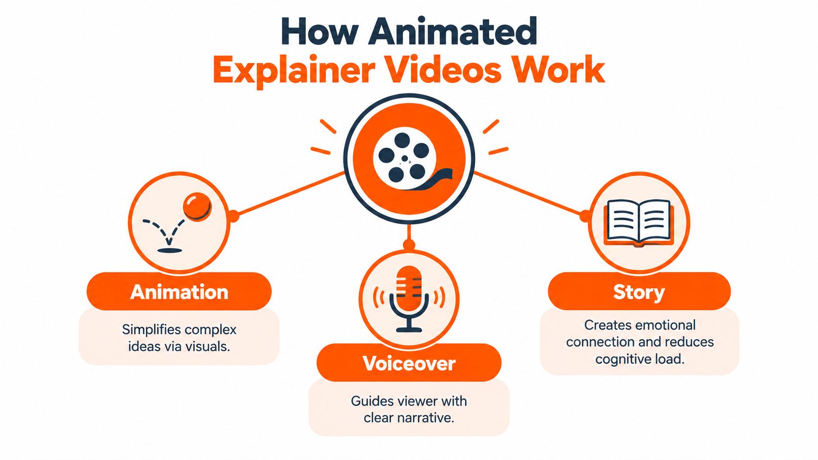
The three parts that carry understanding
Animation makes abstract information visible. A data pipeline can become a series of flowing signals. A security process can become a locked path with checkpoints. A project management problem can become a character juggling tasks until the product brings order to the scene.
Voiceover gives the viewer a route through the visuals. It should sound like a helpful colleague, not a legal disclaimer trapped in a microphone. The narration explains what matters while the visuals demonstrate or reinforce the point.
Story creates sequence and meaning. The typical structure starts with a familiar problem, introduces the solution, shows the resulting benefit, and ends with one next step. This structure lowers the mental effort required to connect isolated features to a practical outcome.
Teams looking for additional formats around audio and video can browse these video content ideas for podcasters, especially when a product story needs to become more than one published asset.
Where animated explainers fit
At the top of the funnel, animation can create curiosity around a problem buyers recognize. On a homepage, it can clarify the product before a visitor chooses whether to request a demo. In a sales process, it can reinforce a presentation without asking a salesperson to repeat every diagram. During onboarding, a shorter feature explanation can help a customer reach the first useful action.
The format works because viewers can see relationships rather than merely read about them. A paragraph says that three systems connect. Animation shows the connection, the handoff, and the point where the product adds value. That difference is small on paper and enormous in comprehension.
Popular Animated Explainer Styles and When to Use Each
Choosing an animation style is less like picking a favorite color and more like choosing a vehicle. A bicycle is excellent for a short trip. A delivery van is better for moving equipment. A rocket may be impressive, but it's a strange choice for collecting groceries.
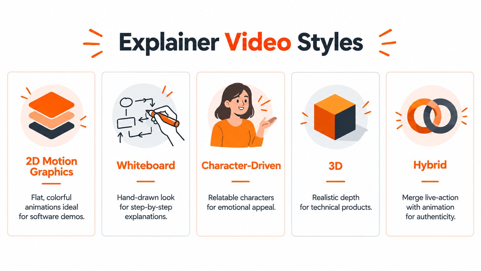
Match visual language to the message
2D motion graphics suit software interfaces, process diagrams, dashboards, and brand-led storytelling. Shapes, icons, text, and interface elements can move quickly without requiring a fictional cast. The risk is visual sameness, especially when every scene becomes a bouncing circle wearing the company color.
Whiteboard animation works well for sequential teaching. It can make a policy, financial process, or healthcare workflow feel like a lesson drawn in real time. It's less suitable when the brand needs a polished, premium feel or when the product itself needs detailed screen proof.
Character-driven animation gives human problems a human face. A character can struggle with scattered approvals, celebrate a clean workflow, or discover that the “urgent” spreadsheet was fine. This approach fits products where emotion, teamwork, or behavior change matters.
3D animation adds depth and physical realism. It can help explain hardware, industrial systems, medical devices, or spatial environments. It also needs stronger art direction, because a technically impressive object can still leave the viewer wondering what it does.
Hybrid animation combines live-action footage with animated overlays, motion graphics, UI capture, or illustrated scenes. It's especially useful when the audience needs both human credibility and product evidence.
Style | Best For | Watch Out For
2D motion graphics | Software, workflows, dashboards, abstract concepts | Generic visuals and rushed pacing
Whiteboard | Step-by-step education and instructional content | A style that feels too informal or dated
Character-driven | Human-centered problems and emotional stories | Characters that distract from the product
3D | Hardware, technical products, physical environments | High visual complexity without clear meaning
Hybrid | Trust, demonstrations, executive communication, UI proof | A disconnected mix of footage and animation
The fully animated versus live-action choice shouldn't be treated as a loyalty test. A cybersecurity platform may benefit from a real security leader introducing the threat, followed by animation showing the invisible attack path. A software company may use a real customer voice for credibility, then switch to screen capture for proof and motion graphics for the parts the interface can't show.
The right question is how much realism the buyer needs at each moment. Animation handles abstraction. Live action handles human presence. UI capture handles evidence. Hybrid production works when each layer has a clear job, not when every available technique gets invited to the same party.
How Animated Explainer Videos Are Made From Script to Final Delivery
A polished explainer usually looks effortless because the messy decisions happened before the final render. Production becomes easier when each stage resolves a specific question before the next stage begins.
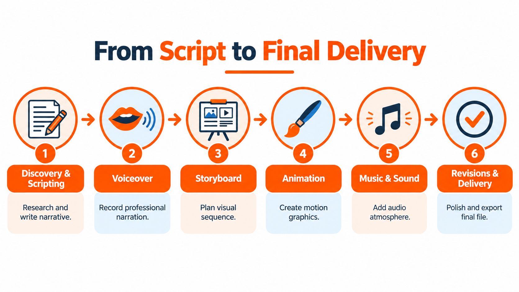
Start with the message
Discovery and scripting define the audience, buying stage, problem, promise, proof, and call to action. The script should sound natural when read aloud and should remove any sentence that merely admires the product. Teams that need a starting framework can use these explainer video script templates before drafting.
The script then guides voiceover recording. A professional narrator brings pace, warmth, and emphasis that synthetic delivery or hurried internal narration may miss. The voice should match the buyer and situation. An enterprise compliance video needs a different temperament from a playful collaboration tool.
Turn words into a visual plan
The storyboard maps each line of narration to a visual action. It can show a rough character pose, a product screen, a diagram, or a transition. The storyboard prevents a common production disaster: narration describing one idea while the screen illustrates another.
An animatic adds timing before full animation begins. It's the skeleton of the final video, with rough visuals and recorded voiceover. If the opening drags or the explanation runs long, fixing the problem here is far easier than rebuilding finished scenes.
Animate, polish, and deliver
During animation, the team creates movement, transitions, typography, interface highlights, and visual effects. Motion should direct attention, not behave like a puppy that has discovered a new squeaky toy. Every movement needs a reason.
Music and sound design add atmosphere, but narration remains the priority. Music that competes with the voiceover makes a polished video frustrating to use. Licensing also matters, particularly when the video will run in paid campaigns or across public channels.
Revisions should happen against a shared checklist. Feedback such as “make it pop” creates a scavenger hunt. Feedback such as “the product benefit arrives before the interface proof” gives the editor a solvable task. Final delivery should include the versions required for the planned placements, such as horizontal, vertical, square, captions, and a clean master file.
Length Formats Timelines and Delivery That Drive Conversion
“Keep it short” is useful advice until a product needs more than one sentence. The better question is short for which buying stage and which decision?
For awareness, a compact video can create recognition around a problem without explaining every workflow. Under-one-minute videos often show strong engagement, while the practical ceiling for many marketing explainers is commonly treated as 60 to 90 seconds, as discussed in research on explainer-video features and effects.
Use length as a tradeoff
A homepage conversion video has a different job from an awareness ad. It may need to explain the problem, demonstrate the product category, establish relevance, and invite a demo. Recent benchmark commentary reports that explainers often cluster at 60 seconds, with 70, 50, 80, and 90 seconds also appearing frequently, according to Animaker's State of Animation coverage.
The same source describes mid-funnel explainers as performing best around 60 to 120 seconds, depending on complexity and intent. That doesn't make 120 seconds a default. It means a qualified viewer who is actively evaluating a solution may tolerate more detail than a casual viewer scrolling past an ad.
A practical decision model looks like this:
Awareness: Use the shortest version that makes the problem recognizable and creates curiosity.
Homepage conversion: Give the buyer enough time to understand the value and see credible product evidence.
Sales enablement: Extend the explanation when the audience has already shown intent and needs help comparing workflows.
Onboarding: Prioritize one action per video rather than forcing every feature into a grand finale.
Deliver for the viewing environment
The video should be planned for its destination from the start. A horizontal master may suit a website or YouTube placement, while vertical and square versions can support social distribution. Captions improve accessibility and help the message survive muted playback.
Teams experimenting with synthetic presenters, generated scenes, or mixed production can also review guidance on how to create realistic AI video for marketing. The production method matters less than whether the final asset feels credible, clear, and relevant to the viewer's decision.
Real World B2B Examples for Acquisition and Onboarding
A SaaS homepage often has a quiet problem. Visitors understand the category, but they don't understand why this particular product deserves attention. An animated explainer can show the difference between the old process and the new one without asking visitors to decode six feature cards.
For example, a revenue operations platform might open with a marketer checking three dashboards that disagree. Animation can show the conflicting information converging into one view, then show the team acting on a cleaner signal. The story doesn't need to claim a performance lift. Its job is to make the product's role obvious enough that the buyer continues exploring.
A paid LinkedIn ad needs a different cut. The audience may recognize the business problem but have little patience for a full tour. A short version can focus on one sharp pain point, use a single visual metaphor, and end with a focused invitation to learn more. The same core production can support several openings, each aimed at a different role or objection.
Sales support without the repeated whiteboard
Sales teams can use a longer version after discovery. A procurement automation product might show a request moving from submission to approval, then highlight where the platform records decisions and keeps stakeholders informed. The salesperson can discuss commercial details instead of spending the entire call explaining what a purchase request is.
A library of relevant B2B explainer video examples can help teams study how different products balance problem, product evidence, tone, and action.
Onboarding that doesn't feel like homework
Customer education benefits from narrower videos. One clip can explain workspace setup. Another can show how to invite colleagues. A third can demonstrate a reporting workflow. Each video answers one practical question, so a new customer doesn't have to sit through a feature parade before completing the first useful task.
Humor can help, but it should support recognition rather than make the product look unserious. A tiny animated character drowning in browser tabs may create a smile. The interface still needs to be accurate enough that the customer can follow along without shouting, “That button isn't there.”
Your Next Steps to Launch an Animated Explainer That Converts
A strong brief can prevent a surprisingly expensive creative identity crisis. Before production begins, the marketing team should agree on the buyer, buying stage, central problem, desired action, proof available, visual style, distribution channels, and review owners.
The length decision should follow the job. Awareness usually needs a concentrated idea. Homepage conversion needs enough context to remove friction. Sales and onboarding can justify more detail when the audience already has intent or needs instruction.
A practical launch checklist
Name the viewer. A first-time visitor, trial user, procurement lead, and internal champion need different explanations.
Choose one outcome. “Understand the product” is too broad. “See how the platform consolidates approval requests” gives the script a usable target.
Select the trust layer. Use animation for abstraction, screen capture for proof, and live action for human credibility.
Lock the script early. Late wording changes create visual rework, timing problems, and review fatigue.
Approve the storyboard. The team should confirm that every major narration beat has a useful visual.
Plan every format. Decide whether the website, ads, social channels, sales team, and onboarding hub need different cuts.
Measure the right behavior. Watch completion, clicks, demo requests, trial starts, assisted conversions, and viewer questions instead of treating views as the whole story.
Teams comparing production models can review explainer video rates, then weigh cost against the value of professional scripting, voiceover, animation, revisions, and repurposing.
Google's search guidance also matters for the FAQ portion of this page. Google deprecated FAQ rich results, so FAQ markup no longer produces the old dropdown-style result for most sites starting May 7, 2026, according to Google's FAQ structured data documentation. FAQ content can still help readers, but the visible answers must match the markup, use one answer per question, and avoid repeating the same marked-up FAQ across pages, as outlined by Schema App's FAQ guidance. Google also says official questions and answers should be written by the site itself and fully visible on the page, according to Google's structured data announcement.
The next sensible move is simple: choose one high-value product explanation, write the shortest version that can make it clear, and test whether the audience understands the message without a salesperson standing nearby.
ContentBuck plans, scripts, produces, and repurposes B2B video, including 60 to 90-second animated explainers, professional voiceover, multiple aspect ratios, and revisions through approval. Visit ContentBuck to discuss an explainer that makes a complex product easier to understand and easier to buy.
Parth Jasrapuria
Founder at ContentBuck
Building video systems for B2B businesses. Obsessed with YouTube growth, creative strategy, and organic SEO.