Explainer Videos Animated That Convert B2B Buyers Fast
Parth Jasrapuria
Founder
A SaaS buyer lands on a product page, scrolls past a cheerful headline, hits a block of feature copy, and exits like someone backing out of a meeting that should've been an email. Nothing is technically wrong. The page has screenshots, bullets, and maybe even a tasteful gradient. The problem is simpler. The value isn't clear fast enough.
That's where explainer videos animated for B2B teams earn their keep. They take something abstract, layered, and slightly headache-shaped, then turn it into a short story a busy buyer can follow. Instead of asking someone to decode a workflow from text alone, animation shows the workflow in motion. That matters when the product involves APIs, onboarding steps, compliance logic, integrations, or any other concept that makes non-technical buyers blink twice.
Explainer videos became a recognizable marketing format in the late 2000s, with Dropbox's 2009 explainer by Common Craft often treated as a turning point for modern software marketing. Later industry tracking reported that 73% of video marketers said explainer videos were their most-used video format in a 2025 roundup, which shows how thoroughly the format moved into the mainstream according to this animation marketing statistics roundup.
The useful twist is this. Animated explainers aren't magic conversion buttons. They're comprehension accelerators. They help buyers understand faster. Then the page, the follow-up email, the demo flow, and the sales process do the rest.
Introduction Why Complex B2B Ideas Need Animated Explainers
A familiar B2B scene plays out every day. A founder loves the product because the product makes sense from the inside. The buyer sees a homepage that says things like “unified orchestration layer,” “intelligent workflow visibility,” and “compliance-ready automation.” The founder nods proudly. The buyer squints like they've just read furniture assembly instructions translated three times.
That gap is exactly why animated explainers exist.
Where confusion usually starts
Most complex offers don't fail because they lack capability. They fail because the first explanation asks too much from the audience. A buyer has to read, infer, connect dots, and imagine the outcome without enough context. That's a heavy lift for someone who's also answering Slack messages and deciding what to order for lunch.
An animated explainer compresses that effort into a short guided sequence. It says, in effect, “Here's the problem. Here's what happens now. Here's how this product changes it.” The buyer doesn't have to build the picture alone.
Buyers rarely need more features on the page. They need less confusion in the first few seconds.
Why animation works so well for software
Software often deals in invisible things. Permissions. Data flow. Triggers. Integrations. Risk checks. Approval paths. None of that is naturally cinematic. A live-action camera pointed at an office whiteboard won't suddenly make an API handshake thrilling.
Animation gives teams a practical shortcut:
It makes abstract ideas visible by turning systems into icons, flows, and cause-and-effect scenes.
It keeps the message controlled because every frame can match the script, unlike a filmed scene that may add clutter.
It simplifies without dumbing down when the story sticks to one main takeaway.
A 2022 systematic review found mostly positive short-term effects on knowledge from explainer videos, with some positive effects on attitudes, cognitions, and behavior, and almost no evidence of worse outcomes from animation. The review also noted that the evidence base was variable, so the strongest use case is a clearly structured explanation where visual simplification lowers cognitive load as described in the Frontiers review on explainer videos.
The practical point is simple. When a B2B team needs to make a dense idea click quickly, animation can do the heavy lifting.
What Animated Explainer Videos Are and How They Work
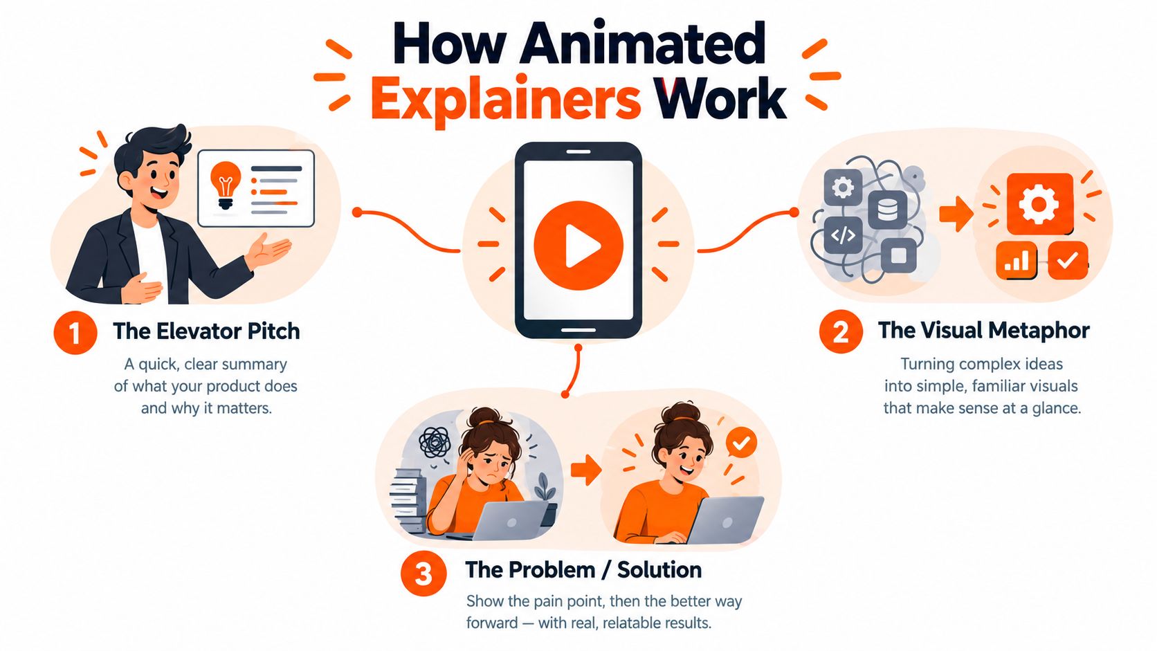
An animated explainer works a lot like a strong elevator pitch, except the walls don't smell like burnt coffee and nobody's pretending to understand “synergy.” It takes a product, problem, or process and explains it through a tight script, clear visuals, and motion that guides attention.
The simplest way to think about it
A useful mental model is this. A busy friend asks what the product does while walking into a meeting. There's only enough time for one idea, one example, and one next step. That's the backbone of a good animated explainer.
Animated explainers are short visual stories that turn a complex idea into one clear takeaway people can grasp quickly.
The parts that make the message click
A solid explainer usually has four working parts:
Script This is the thinking. The script decides what matters, what gets cut, and what the viewer should remember. If the script tries to explain five things at once, the video becomes a polite disaster.
Visuals Icons, characters, interface cues, diagrams, and metaphors help viewers “see” the idea. For example, a fintech approval workflow can become a package moving through checkpoints instead of a swamp of policy language.
Voiceover The narration keeps the story moving. It should sound human, not like a robot trapped in a compliance handbook.
Motion Animation directs attention. It can reveal sequence, show contrast, or highlight what changes after the product is introduced.
What animated explainers are not
They aren't miniature documentaries. They also aren't the right answer for every job.
A 2026 Animaker analysis of 2M+ projects found that the most common animated explainer length is 60 seconds, followed by 70, 50, 80, and 90 seconds, showing how strongly the market leans toward short-form use in Animaker's State of Animation 2026. That short format fits awareness and quick comprehension well. But text or mixed media can still be more efficient for some information-transfer tasks, especially when a buyer needs to scan, compare, or revisit details.
A good rule is to use animation when the audience needs help understanding a concept in motion. Use text when they need reference material. Use both when the buying journey demands clarity first and detail second.
Animated vs Live Action Benefits You Should Weigh
Choosing between animation and live action is less about taste and more about fit. Both can work. The smarter question is which format matches the message, audience, and channel.
Animation usually wins when the product is invisible, technical, or process-heavy. Live action usually wins when trust depends on showing real people, real environments, or a tangible product.
The comparison gets clearer with actual viewing behavior. Industry statistics compiled in 2025 reported that animated explainer videos under 90 seconds achieved an average viewer retention rate of 79%, compared with 52% for comparable live-action videos. The same roundup also cited that animated explainers can lift conversion rates by about 20%in this collection of animated video statistics. That doesn't mean animation beats live action in every case. It means short animated explainers are especially strong when the job is fast understanding.
A quick way to decide
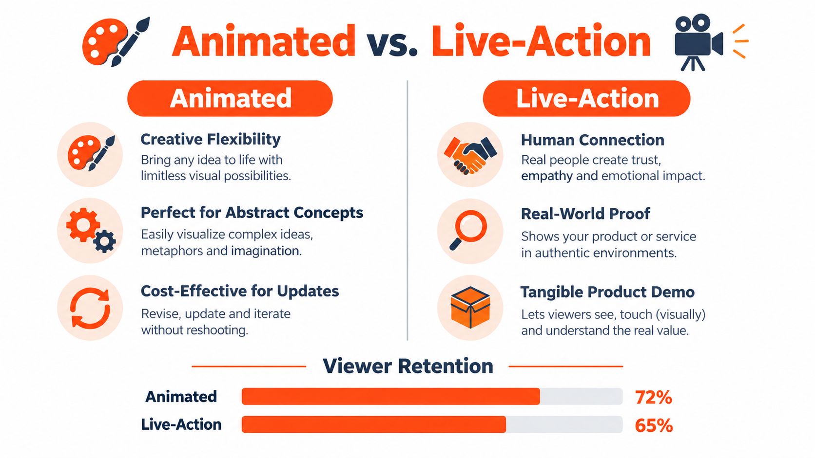
Criteria | Animated Explainer | Live Action Explainer
Complex software concepts | Strong fit for APIs, workflows, and abstract systems | Harder to show invisible processes clearly
Production setup | No actors, locations, or filming days needed | Requires talent, scheduling, gear, and space
Updating later | Easier to revise scenes, text, and branding | Reshoots can be awkward and expensive
Human warmth | Can feel friendly, but stylized | Stronger for faces, credibility, and culture
Brand consistency | Easier to adapt across aspect ratios and markets | More variables across shoots and edits
Real-life examples make the choice easier
A team selling warehouse robotics software might use live action to show the actual machines in motion. That's proof.
A team selling identity verification software might use animation instead. A verification flow, fraud alert, and data-routing sequence are easier to understand when they're diagrammed visually instead of performed by actors in an office lobby pretending to look concerned at a laptop.
A short video example helps make the difference more concrete.
When animation is the smarter B2B bet
Abstract process: A product handles permissions, routing, compliance, or integrations.
Multiple channels: The team needs versions for web, paid social, and sales follow-up.
Frequent updates: Messaging or UI details may change and shouldn't force a full reshoot.
Global consistency: The brand needs one visual system that travels well across formats.
Live action still has a place. But if the message starts sounding like “first the event triggers the rules engine,” animation usually saves the day before the audience starts mentally reorganizing their sock drawer.
How Animated Explainer Videos Are Made From Script to Launch
The production process sounds mysterious until it's broken into plain steps. It's not wizardry. It's sequence. A good animated explainer comes from making the right decisions early, not from tossing effects at a weak script and hoping for cinema.
Start with buyer clarity, not scene ideas
The first job is understanding the audience. Not “everyone in operations.” Not “mid-market leaders.” A tighter view works better: who has the problem, what confuses them today, and what single idea should stick after the video ends?
That's why teams often pair video planning with broader messaging work. A practical companion resource is this guide on agency content strategy 2026, which helps connect audience intent, channel use, and content structure before production starts.
The five steps that keep the project sane
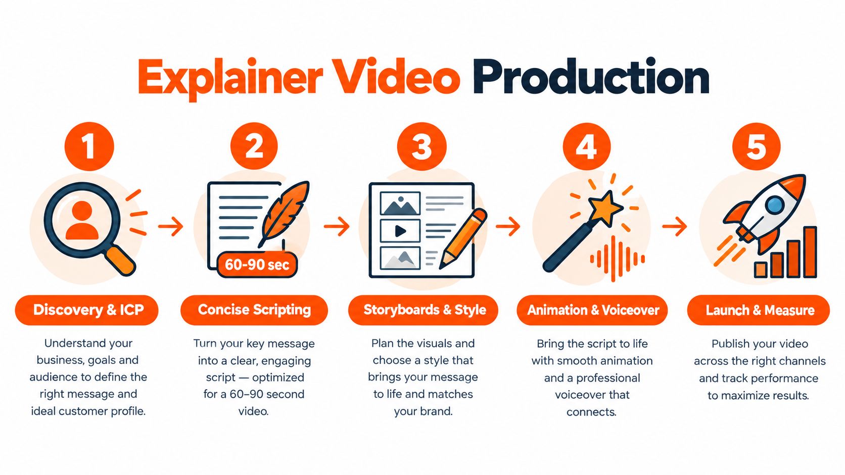
Discovery and ICP input The team gathers positioning, customer pain points, objections, screenshots, and product context. If the brief says “make it pop,” the scriptwriter ages five years.
Concise scripting For most B2B use cases, 60 to 90 seconds is a strong default. That forces discipline. The script should front-load the value proposition, avoid feature pileups, and build around one takeaway.
Storyboards and style frames
Words become scenes. A storyboard maps what appears on screen, while style frames lock in the visual approach so the final animation doesn't surprise anyone in a bad way.Animation and voiceover Motion, transitions, pacing, narration, music, and sound design come together here. The best motion supports understanding. It shouldn't behave like it drank six espressos.
Launch and channel versions The final video is exported for the website, ads, LinkedIn, YouTube, or sales use. Different placements often need different aspect ratios, captions, and cutdowns.
What practical delivery looks like
A B2B team evaluating vendors will usually want script support, voiceover, revisions, and fast turnaround. One example is animated video production services, where the workflow includes script writing, animation, professional voiceover, multiple output formats, unlimited revisions until approval, and roughly 14-day delivery from script sign-off. For adjacent editing needs, some teams also run ongoing ad-variant or clip refresh cycles with 24-hour turnarounds for edit requests.
Production rule: If the value proposition appears too late, the video is asking viewers for patience they haven't agreed to give.
A short checklist teams can hand off
One core message: If the script contains three headlines, it probably contains none.
Concrete example: Use a familiar scenario early, like handoffs, approvals, or missed follow-ups.
Visual logic: Every scene should clarify, not decorate.
Channel planning: Prepare web, ad, and social versions before launch day.
Revision discipline: Review for clarity first, taste second.
Real World B2B Examples and Best Practices That Work
The easiest way to understand explainer videos animated is to watch what happens when a messy message gets translated into ordinary human language. Not “leveraging modular infrastructure.” More “this stops leads from falling through the cracks.”
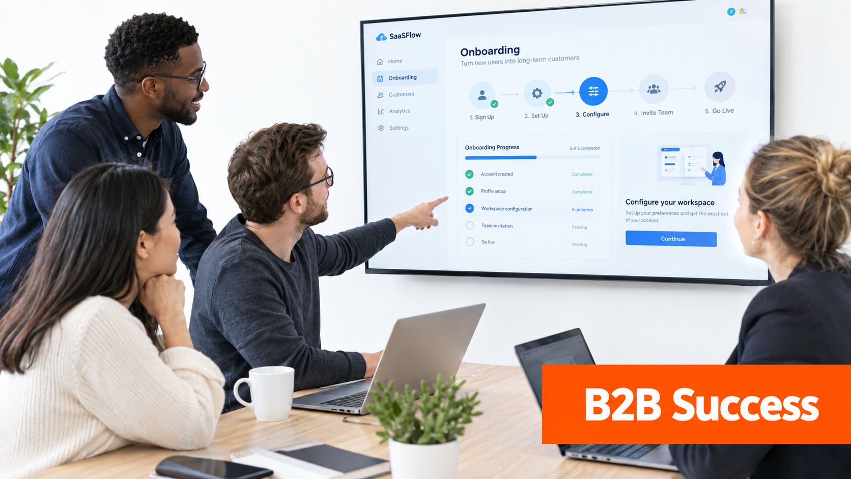
Example one SaaS onboarding
A SaaS platform helps operations teams assign tasks after a customer signs. The raw description might mention triggers, status changes, user permissions, and CRM syncing. Most buyers won't remember that.
A clearer explainer shows a new customer entering the system like a package arriving at a sorting center. One label triggers onboarding. Another sends tasks to the right teammate. Nothing gets lost. That everyday analogy turns a software process into something the brain grabs quickly.
Example two fintech compliance
Compliance products often sound important and exhausting at the same time. An animated explainer can show a customer application moving through checkpoints, with each policy check acting like a security gate at an airport. It's a familiar mental model. The viewer understands sequence, review, and approval without drowning in legal wording.
A few strong reference points help here. Teams looking for inspiration can study practical best B2B explainer video examples to see how different industries handle abstract offers.
Example three professional services
A consulting firm that audits revenue operations might explain its offer using a “leaky bucket” analogy. Leads enter the funnel, but handoff gaps, poor routing, and reporting messes let opportunities slip out. The animation turns a fuzzy service into a visible problem with visible fixes.
A practical example beats a polished slogan almost every time.
Best practices that actually help
Keep one takeaway: If the audience remembers one thing, what should it be?
Use humor lightly: A small wink helps. A stand-up routine doesn't. Nobody needs a compliance explainer that tries to become late-night TV.
Design for sound-off viewing: Captions and clear visual sequencing matter, especially on social feeds.
Tailor cuts by channel: LinkedIn viewers, YouTube viewers, and paid social audiences don't behave the same way.
Show before and after: Confusion first, clarity second. The contrast makes the message stick.
The strongest examples feel simple on the surface. That simplicity is built, not accidental.
Choosing the Right Length and Making Viewers Remember
A buyer lands on your page between meetings, clicks play, and gives you about a minute of real attention. That minute does not need to do every job. It needs to do the right job.
That is the mistake many B2B teams make with animated explainers. They treat the video like a closer when it is usually a comprehension accelerator. It helps a prospect grasp the problem, the change, and the next logical question faster. Conversion improves when that clarity connects to a follow-up task, page, or conversation.
Length should follow intent. A product intro for a cold visitor and a walkthrough for an active evaluator should not be forced into the same runtime. If you want a more detailed length-by-intent framework for B2B explainer videos, start there before debating seconds.
Here is the practical version:
Intent | Strong default | What the viewer is trying to do
Awareness | 45 to 90 seconds | Decide, "Is this relevant to my problem?"
Product understanding | 90 seconds to 2 minutes | Grasp how the offer works and why it is different
Deeper evaluation | 2 minutes or a short series | Compare options, understand workflow, and judge fit
The easiest analogy is a sales conversation. You would not open a first meeting with a 20-minute product tour. You would frame the problem, show the change, and earn the next question. Animated explainers work the same way.
Memory works the same way too. Clear viewing is not the same as lasting understanding. People often feel they understood a video because it was easy to follow in the moment, then struggle to recall the logic later without a prompt.
That is why the strongest explainer setups pair the video with one concrete next step:
A checklist that helps the buyer connect the message to their own process
A guided tour for viewers who want proof and detail
A short FAQ that answers the first objections while the story is still fresh
A follow-up email or sales one-pager that repeats the same core idea in plain language
This pairing matters more than shaving ten seconds off the runtime.
A simple rule helps here. If the viewer needs to remember one idea, keep the story tight and the visuals clean. If the viewer needs to make a decision, give them a second asset after the video. The video is the whiteboard sketch. The next asset is the worksheet.
Small creative choices also help recall. Put the concrete example early. Use one visual metaphor and stay with it. Repeat the core phrase once or twice instead of introducing new wording every few scenes. Variety feels creative in a brainstorm, but consistency is what helps a busy buyer remember you on Thursday.
The goal is not just "watched." The goal is "understood, then acted on." A polished explainer without a next step is a good presentation with no agenda. Nice to watch. Easy to forget.
Frequently Asked Questions About Animated Explainer Videos
How long should an animated explainer be for B2B
For many B2B awareness and landing-page use cases, 60 to 90 seconds is a strong default because it forces a tight script and makes completion more likely. If the topic needs more explanation, a longer version can work, but it should earn the extra time with clear structure. A useful next step is to decide the viewer's job first: understand, compare, or take action.
How should keywords and schema be used for SEO visibility
The page should use relevant search language naturally in the heading, body copy, image alt text, and FAQ content. FAQ schema works best when it matches visible page content, uses JSON-LD, and is validated before publishing, which helps search engines interpret the page and improve eligibility for rich results as explained in this guide to FAQ schema markup. The practical check is simple: if the question and answer aren't visible on the page, the schema shouldn't pretend they are.
What should go into a brief if a team wants revisions to stay useful
A strong brief includes the audience, one primary takeaway, the page where the video will live, examples of tone, brand rules, screenshots or product context, and what should happen after the video. Revisions go more smoothly when feedback is grouped by clarity, visuals, and compliance rather than scattered comments like “make it cooler.” The team should also name one final decision-maker before production starts. That alone can save everyone from the ancient corporate ritual known as “fifteen people tweak one sentence.”
How should success be measured beyond views
Views are only the first signal. Better checks include whether viewers understand the offer faster, whether sales calls spend less time on basic explanation, whether on-page engagement improves, and whether follow-up actions become more consistent. A useful next step is to define one post-view action in advance, such as booking a demo, starting a tour, or reading a deeper solution page.
What makes FAQ sections valid for search engines
FAQ sections need real, visible questions and answers, not disguised ad copy. Google-focused guidance says the full text of each question and answer should be visible on the page, the content shouldn't be promotional, the markup should use FAQPage with Question and acceptedAnswer, and the same question shouldn't be duplicated across multiple pages according to these FAQ schema best practices. The practical move is to write the FAQ for an actual buyer first, then mark up that exact content.
ContentBuck plans and produces B2B animated explainers with scripting, voiceover, multiple aspect ratios, and the surrounding content needed to support real buyer understanding, not just pretty motion. Teams that need video tied to SEO, ads, and post-view follow-up can explore the full setup at ContentBuck.
Parth Jasrapuria
Founder at ContentBuck
Building video systems for B2B businesses. Obsessed with YouTube growth, creative strategy, and organic SEO.