Thumbnail Design That Gets Clicks: A B2B Video Playbook
Parth Jasrapuria
Founder
The loudest thumbnail isn't automatically the strongest one. Big face, bold text, red arrows, and maximum shock can look impressive in Figma, then collapse into visual soup when a B2B buyer scrolls on a phone between meetings. The better question is simpler: can someone understand the video's value before the thumbnail shrinks to the size of a postage stamp?
Thumbnail design became a serious growth lever when YouTube moved from fixed video frames to custom uploads, first for Partner Program members around 2010 and later for broader creator access by 2013–2014. By 2015, YouTube had standardized the familiar 1280 × 720, 16:9 format, turning the thumbnail into a deliberate marketing asset rather than a lucky pause in the footage. Industry summaries place typical YouTube CTR around 3–4%, with strong performance often starting around 5–7%, so small visual improvements can change the traffic a video earns. The history and performance context are covered by YT Thumbnail.
For B2B teams, the winning formula is usually quieter. A clear product interface, one useful promise, a recognizable brand cue, and enough contrast to survive a small screen can beat a theatrical face that says “I have just discovered electricity.”
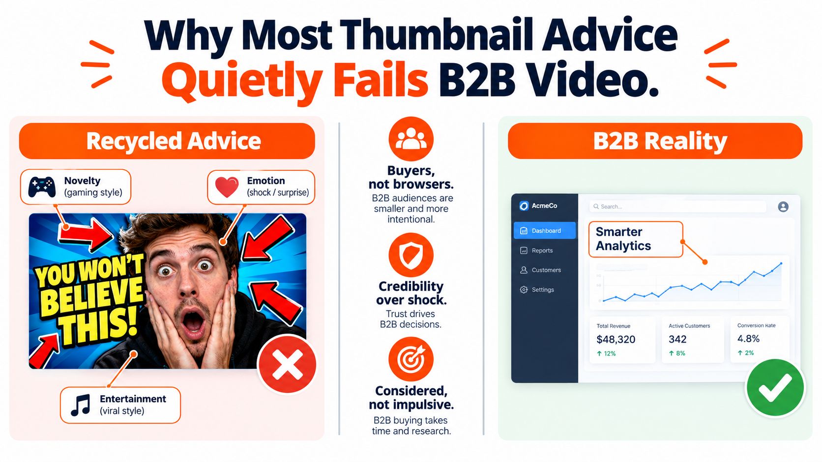
Why Most Thumbnail Advice Quietly Fails B2B Video
The familiar formula, enormous face plus chunky headline plus arrows pointing at something mysterious, came from categories built around entertainment. Gaming, beauty, reaction content, and creator drama often benefit from novelty and visible emotion. A software buyer comparing workflow tools or watching a technical explainer has a different job. That viewer wants a fast signal of relevance, not a visual fire alarm.
Recent evidence supports a reduction-first approach. A 2026 study of 11,223 thumbnails found that 23% had no words at all, while the median word count among thumbnails with text was only four. Channels above 2 million subscribers were text-free 32% of the time, suggesting that more copy isn't a universal advantage. The Thumbnail Bench study reported by Business Insider points toward a useful B2B decision rule: add text only when the image and title can't communicate the promise clearly enough without it.
The small-screen test
A B2B thumbnail often appears beside dense search results, suggested videos, or a LinkedIn feed full of competing messages. Mobile-first guidance recommends testing readability around 120–160 pixels wide, while the study above found that top-performing channels frequently remove words instead of shrinking them into microscopic confetti. HookSnap's mobile thumbnail guidance also stresses safe zones, strong contrast, and fewer visual elements.
This changes the design brief. A dashboard screenshot with one highlighted result may communicate more than a person pointing at six floating icons. A product manager's face can help when it carries a clear expression and supports the topic, but a random surprised expression adds theatre without adding meaning.
Recognition beats spectacle
Consistent colors, layout patterns, and brand marks help repeat viewers identify a channel quickly. The system shouldn't make every thumbnail identical, though. A dark navy base, one brand accent, and a recurring subject position can create recognition while leaving room for each video's central idea.
Practical rule: If the thumbnail needs a meeting to explain itself, it isn't doing enough work at feed speed.
The B2B approach rests on three decisions: compose one clear focal point, write only what survives a phone screen, and export for the surface where the viewer sees the asset. The result may look less dramatic in a design review. That's fine. A thumbnail isn't a poster for the design team. It's a small signpost for a busy buyer.
Composition Rules That Make Thumbnails Instantly Clickable
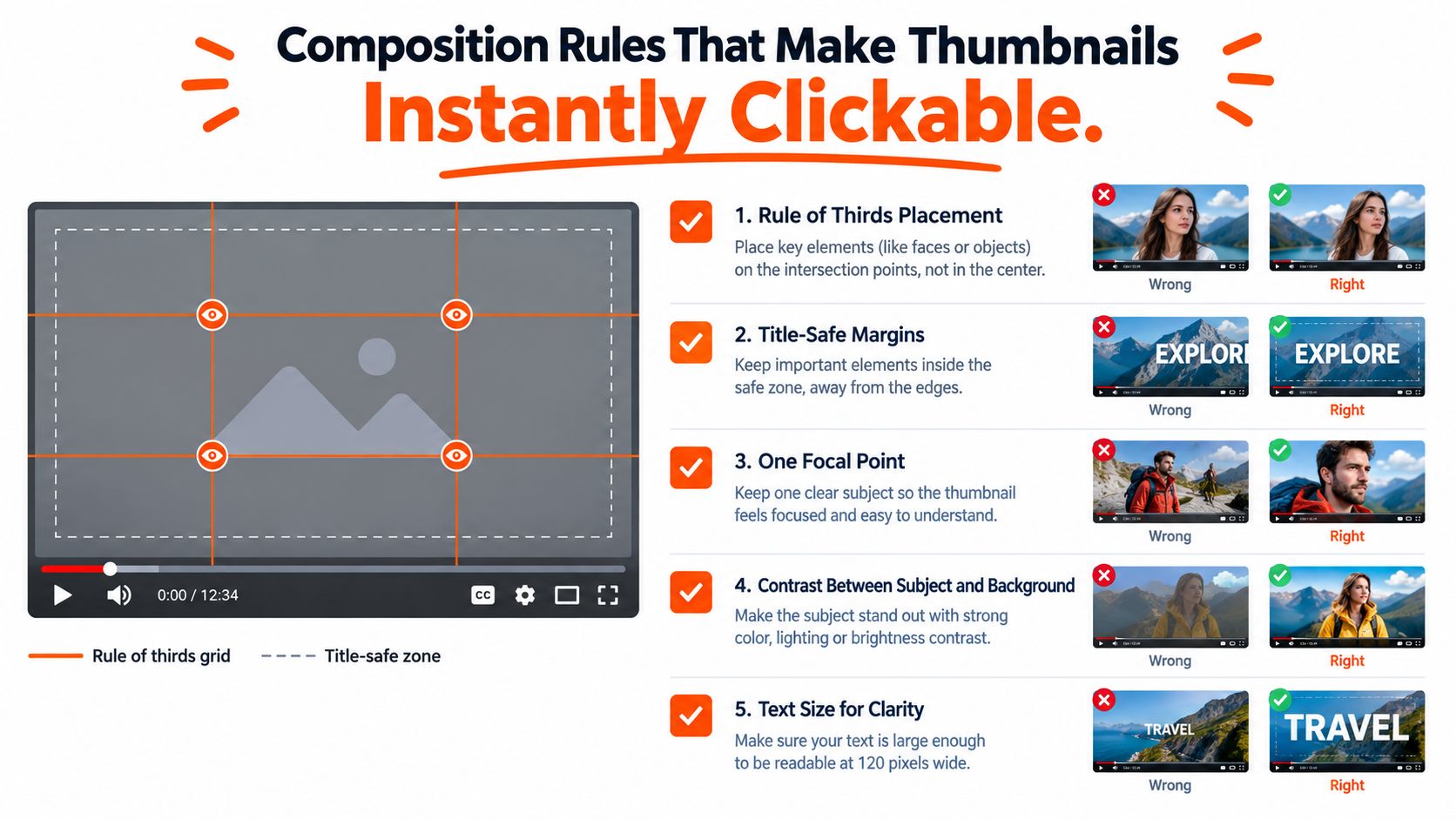
A strong composition gives the eye one obvious place to land. Start with a rule-of-thirds grid, dividing the frame into nine equal sections and placing the subject near an intersection rather than dead-centre by habit. Keep the main label inside an inset safe zone so YouTube's controls, duration badge, or platform cropping don't chew off the important bits. ThumbMagic's thumbnail design principles offers a practical explanation of this grid and the value of edge margins.
Consider a product demo thumbnail with six competing elements: presenter, laptop, dashboard, three icons, headline, and logo. A cleaner version keeps the dashboard as the subject, adds one soft highlight around the relevant metric, and reduces the logo to a small corner mark. The viewer can identify the topic faster because the design has stopped asking every object to become the lead actor.
Contrast without visual shouting
Contrast separates the subject from the background. Recent aggregate testing found that thumbnails with a contrast ratio of 7:1 or higher averaged 9.2% CTR, while those below 4.5:1 averaged about 2.9%. The ThumbnailCreator CTR trends analysis provides that comparison. The practical lesson isn't to turn every asset into black and neon orange. It's to make sure the product, face, or headline doesn't disappear into its background.
A single dominant face can work well when the expression matches the subject. One 1,000-thumbnail study reported 6.8% CTR for thumbnails with a human face versus 4.1% without one, alongside a preference for tight crops, high-contrast backgrounds, and short outcome-led text. CTR Pilot's thumbnail study gives the supporting detail. A face on the far right, however, may collide with interface overlays, so the subject should have breathing room.
The 30-second pre-publish check
Before export, a producer can run this quick inspection:
Shrink the canvas: View the thumbnail at roughly 120 pixels wide and check whether the subject remains obvious.
Name the idea: Say the thumbnail's central promise in one short sentence. If there are two promises, remove one.
Check the edges: Look for clipped text, awkward crops, and important details sitting under interface controls.
Test the squint: Blur or squint at the design. The focal point should still be visible.
Compare the title: The thumbnail should add context rather than repeat every word of the title.
For teams producing product-led videos, creating compelling product video thumbnails is a useful complementary resource because product interfaces need a different visual hierarchy from personality-led creator content.
Writing Text and Choosing Colors That Survive a Phone Screen
Thumbnail copy has one job: clarify or sharpen the click decision. It isn't a miniature landing page. A practical ceiling is three to five words, with another source advising no more than five to six before the design becomes crowded. Website Planet's thumbnail glossary supports the short-copy approach.
For a B2B SaaS video, “Fix Churn” says more than “How to Build a Customer Retention Strategy.” A single word such as “Pricing” can work when the accompanying interface or face supplies the context. If the title already explains the topic, the thumbnail can show the outcome, tension, or distinctive visual instead of repeating it.
A simple type system
Use one display face for the primary word and one neutral face for supporting context. The display face can carry personality, while the neutral face handles labels and smaller information without turning the thumbnail into a font convention.
The requested working hierarchy is a 48–64 px headline with a 24–32 px supporting line for YouTube layouts. Those sizes belong in the design system, not as a promise that every device will display them identically. At small scale, weight, spacing, and contrast matter as much as nominal size. Font Checker Pro's typography guide is a useful reference for building a hierarchy that holds across screens.
Safe zones and palette logic
YouTube places a duration badge in the lower-right area, so essential text shouldn't sit there. LinkedIn can crop or reframe the left and right edges in-feed, which makes centre-weighted composition safer. TikTok and Shorts need room around the top interface and bottom controls, so designers should keep the upper 20% and lower 25% visually quiet when the asset will appear in a vertical feed.
A reliable palette uses one dominant brand color, one neutral, and one attention accent. For example, a navy interface, an off-white label, and a restrained orange highlight can feel branded without making the viewer wonder whether the software has caught fire. A dark background with light type is usually clearer than medium-gray type over a colorful screenshot.
Platform | Max Words | Headline Size (px) | Min Contrast Ratio | Safe Zone
YouTube | 3–5 | 48–64 | 4.5:1 for small text | Keep key content away from lower-right duration badge
LinkedIn | 3–5 | 48–64 | 4.5:1 for small text | Keep essential content inside the centre area
TikTok | 3–5 | 48–64 | 4.5:1 for small text | Avoid top 20% and bottom 25% UI areas
Platform Specs for YouTube, LinkedIn, TikTok, and Ads
A thumbnail can be beautifully designed and still fail because it was exported for the wrong surface. YouTube's established format is 1280 × 720 pixels at 16:9, with JPG, PNG, and static GIF supported and a file limit under 2 MB. Snappa's YouTube thumbnail guidance covers those specifications and explains why the format prevents stretched or blurry presentation.
LinkedIn's 1200 × 627 pixel, 1.91:1 frame is wider and shorter, so a composition built for YouTube can lose text at the sides or feel strangely empty. TikTok feed and YouTube Shorts use 1080 × 1920 pixels at 9:16, with the bottom area vulnerable to usernames, captions, and controls. Paid ads that reuse the same concept should receive their own crop rather than a lazy resize. The message can stay consistent while the subject, type, and safe zone change.
Platform | Dimensions (px) | Aspect Ratio | Max File Size | Text Safe Zone
YouTube | 1280 × 720 | 16:9 | Under 2 MB | Keep key content clear of lower-right controls
LinkedIn video | 1200 × 627 | 1.91:1 | Check upload limit | Keep text away from side crops
TikTok feed | 1080 × 1920 | 9:16 | Check upload limit | Avoid top 20% and bottom 25%
YouTube Shorts | 1080 × 1920 | 9:16 | Check upload limit | Keep text clear of bottom interface
A practical export preset list prevents a surprising amount of back-and-forth:
YouTube long-form: 1280 × 720, 16:9, JPG or PNG, under 2 MB.
LinkedIn video: 1200 × 627, 1.91:1, with the headline pulled inside the centre.
TikTok and Shorts: 1080 × 1920, 9:16, with a separate vertical composition.
Paid social adaptation: Export the platform's required crop separately, then inspect the live preview.
For a broader reference on best export presets for social video, teams can compare platform dimensions before building templates. A focused guide to best thumbnail design for YouTube can also help producers keep the long-form version distinct from social adaptations.
A Simple Thumbnail Testing Workflow You Can Actually Run
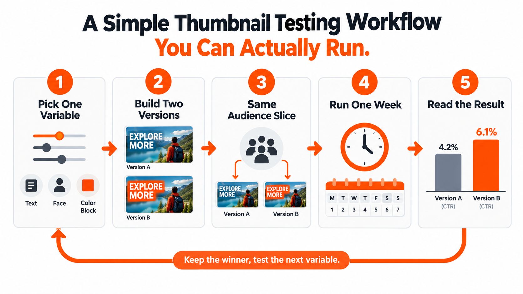
A thumbnail test should answer one question, not create a small laboratory accident. Choose one variable, build two versions, keep the title and audience constant, and record the result. The variable might be a face versus a product interface, a short label versus no label, or a neutral background versus a strong color block.
Independent testing guidance recommends waiting about 7–14 days and targeting at least 1,500–2,000 impressions per variant before judging a result. ThumbnailCreator's testing workflow explains why a test stopped after a few hours can turn random fluctuation into fake certainty.
One variable, one hypothesis
A useful test log might read: “A two-word outcome label will make the product video easier to understand than an interface-only thumbnail.” Version A uses the label. Version B removes it. Everything else stays fixed, including title, crop, background, and publishing context.
The plan notes for a B2B workflow call for 48–72 hours as an initial operating window and roughly 2,000–3,000 impressions per variant before clearing noise. Those thresholds should be treated as a practical testing target, not a universal statistical law. A 50-view sample can make the version shown to one enthusiastic colleague look like a champion. That colleague may have been unusually caffeinated.
Testing rule: Change one element, log the hypothesis, and resist redesigning the whole thumbnail halfway through the test.
Track impressions, CTR to view, audience context, date, and the design change in a shared sheet. Once a winner emerges, keep it and test the next variable. A team that wants to formalize creative experiments can use ad creative testing as a related framework for comparing hooks, layouts, and audience responses.
Why Outsourced Thumbnail Design Pays for Itself
Thumbnail design works better as a production system than as an occasional burst of inspiration. Internal marketers often lose hours nudging a headline two pixels left, changing a face crop, then reopening the file because the logo suddenly looks “a bit shouty.” A specialist process turns those decisions into templates, review rules, test logs, and repeatable handoffs.
The useful comparison isn't designer cost versus no designer cost. It's design spend versus the value of attention that a video already earned. If a better thumbnail lifts YouTube CTR from 4% to 6% on a video that drives 200 MQLs a quarter, the extra clicks can make the marginal design cost look small relative to the pipeline opportunity. Those figures are a planning example, not a promised outcome, and the actual economics depend on traffic quality, offer relevance, and sales conversion.
What a serious partner should provide
A credible thumbnail partner should be comfortable with evidence, not just attractive mockups. The evaluation can start with four practical requests:
Review recent work: Ask for an audit of the last 20 videos and a clear explanation of recurring patterns.
Maintain a test log: Require hypotheses, variants, dates, impressions, and decisions rather than vague claims about “engagement.”
Return editable files: Figma files should come back organized enough for the internal team to reuse.
Match the publishing cadence: Service levels should fit weekly YouTube uploads, campaign launches, or podcast schedules.
ContentBuck offers thumbnail design as part of its B2B video work, alongside YouTube production, editing, repurposing, and SEO-backed content. For teams comparing production models, unlimited video editing services provides a related view of queue-based editing and ongoing creative support.
The strongest outsourcing case is often time, not decoration. A senior marketer can spend that recovered time improving the offer, reviewing sales feedback, or fixing the landing page that receives the click. A thumbnail still has to earn attention, but it shouldn't consume the attention of the person responsible for the entire funnel.
FAQs and Schema Basics for Thumbnail Design Pages
What aspect ratio does YouTube prefer?
YouTube prefers 16:9, with the standard thumbnail canvas at 1280 × 720 pixels. Keep important content away from interface areas and check the design at small size before upload.
How many words can a thumbnail hold?
Three to five words is a practical working range, and many strong thumbnails use fewer or none. The correct amount depends on whether the image and title already communicate the topic without extra copy.
Do custom thumbnails beat auto-generated picks?
Custom thumbnails give the publisher control over the subject, crop, contrast, text, and brand system. An automatically selected frame may work occasionally, but it can't reliably express the video's commercial promise or protect the composition from an awkward facial pause.
How often should a channel refresh its visual style?
Refresh the system when the audience, offer, or content format changes, not because a design team feels restless on a Tuesday. Keep recognizable brand cues while testing individual variables, so the channel learns what works without looking like it has changed owners overnight.
Which schema types belong on a thumbnail design page?
FAQPage describes visible questions and answers. VideoObject describes an embedded or associated video, including details such as its thumbnail URL, width, and height. Article describes the page's written editorial content. Layering relevant markup can help search engines understand the page rather than forcing one schema type to do every job.
FAQ schema must match the visible FAQ content 100%, according to Moz's guidance on interactive rich results. A changed answer on the page with an old answer in the markup is the sort of mismatch that can make a robot suspicious. The robot may not wear a tiny detective hat, but it still checks.
Before publishing, confirm:
Image dimensions: Use the platform-specific canvas, especially 16:9 for YouTube.
Alt text: Describe the visual purpose clearly and naturally.
File size: Keep the thumbnail compressed under 2 MB.
Primary keyword: Include a one-line description that mirrors the page's main phrase, such as “thumbnail design for B2B video.”
ContentBuck builds B2B video systems that include thumbnail design, YouTube production, editing, repurposing, and creative testing for revenue-focused teams. Visit ContentBuck to discuss a repeatable thumbnail workflow that turns more of the right impressions into qualified video attention.
Parth Jasrapuria
Founder at ContentBuck
Building video systems for B2B businesses. Obsessed with YouTube growth, creative strategy, and organic SEO.